Industrial real estate · Product design · Design system · July 2025 to September 2026
Investtal
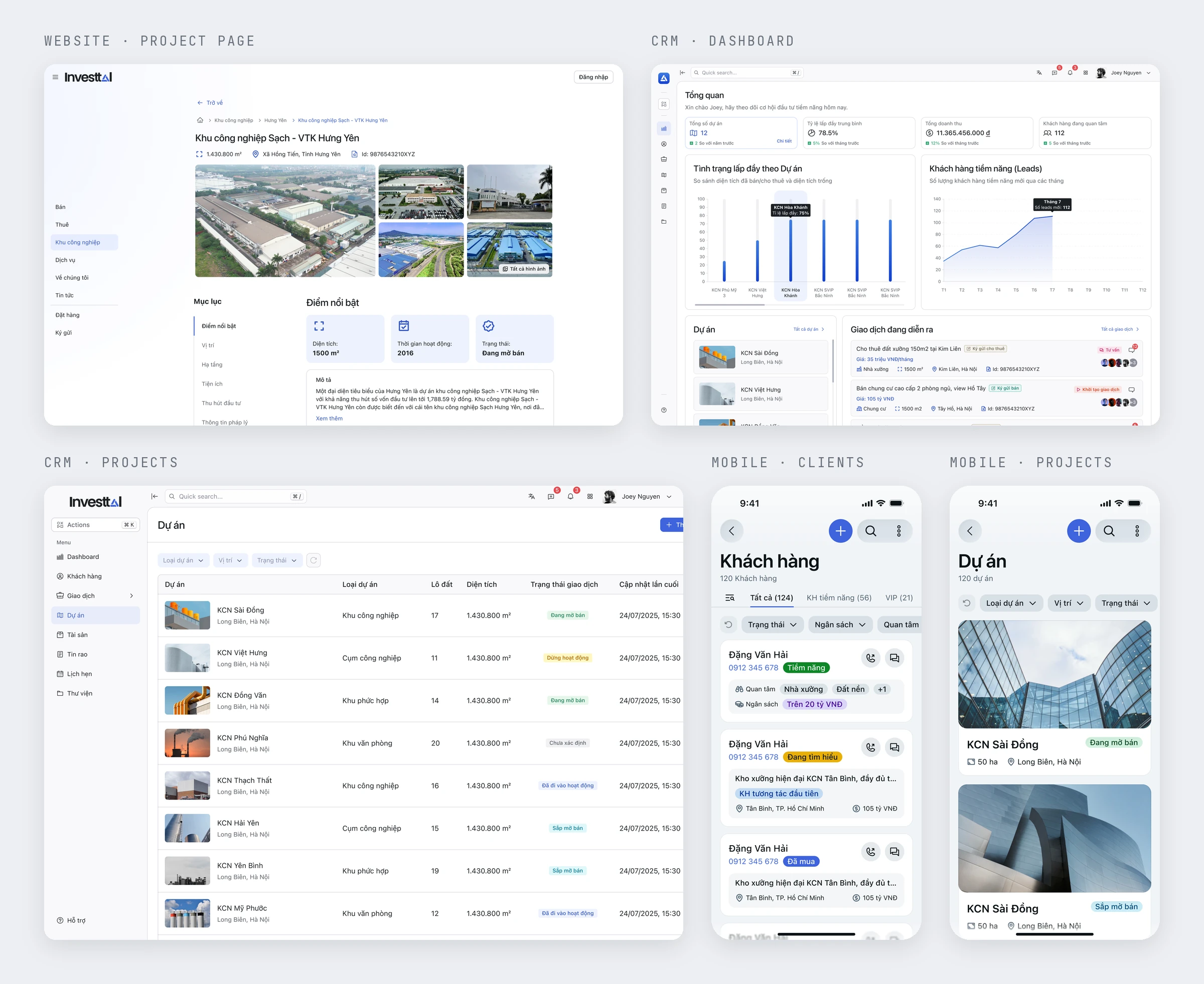
From July 2025 to September 2026, I was Investtal's product designer, responsible for five products for a three-sided industrial real estate marketplace: the public website, the broker CRM, a mobile app, an admin console, and the design system they share.
A marketplace with three sides and long deals
Investtal is an industrial real estate marketplace in Vietnam for land, factories, and industrial parks. It connects three groups: businesses looking for space, brokers who market it, and the investors and owners who supply it. A single deal can run for weeks.
Each side works in a different place. Businesses browse the public website; brokers work in a CRM built around tables, filters, and quick actions, and in a mobile app away from the desk; owners manage their projects and decide what goes public.
My scope covered five products: the website, the CRM, the mobile app, the admin console, and the design system that keeps them consistent. As of September 2026, the product was still in development and had no users.
Decide what to test before building more
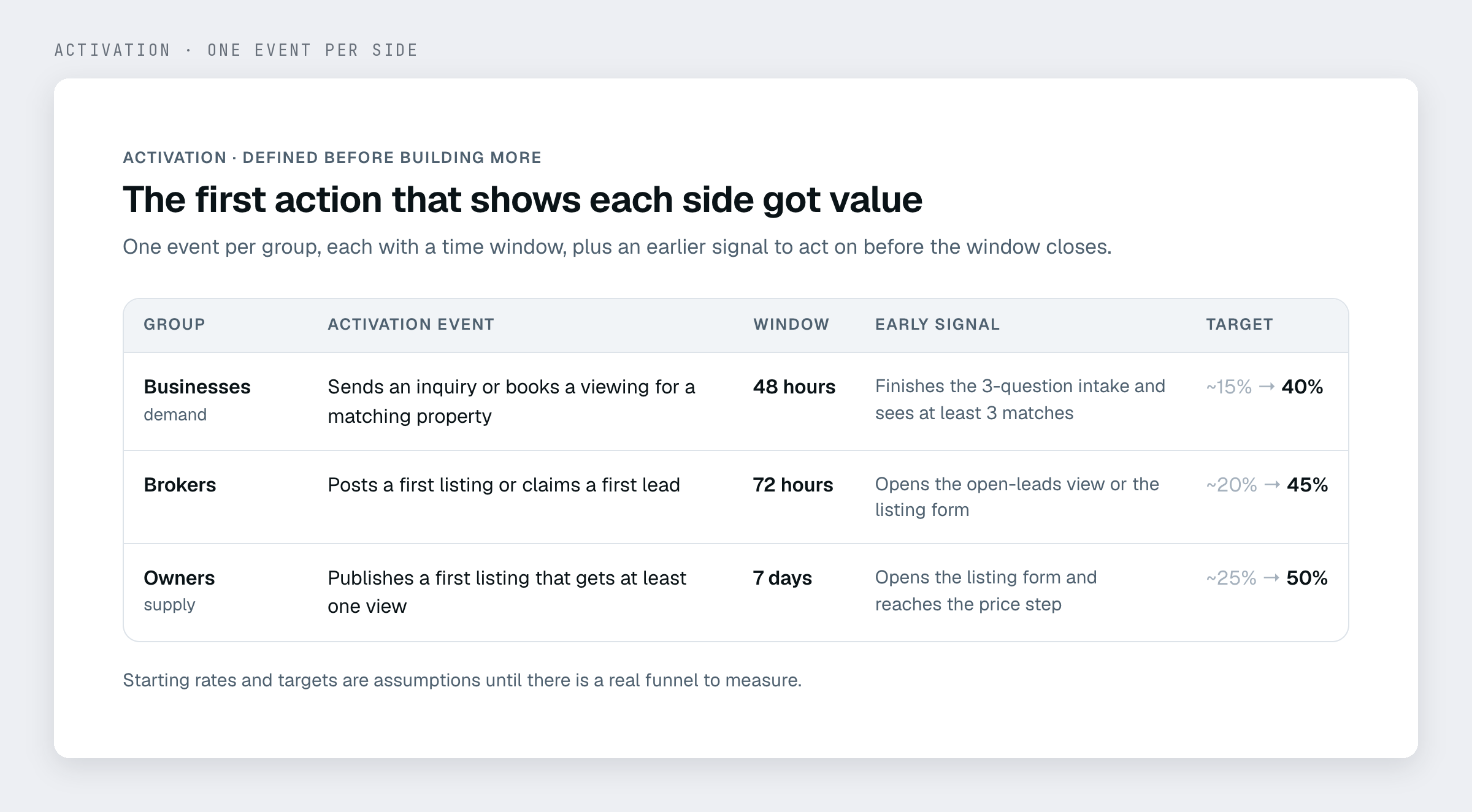
Define activation for each side. Before adding features, I wrote down what a first sign of value looks like for each group, with a time window: a business sends an inquiry within 48 hours, a broker posts a first listing or claims a lead within 72 hours, an owner publishes a listing that gets at least one view within seven days.
The baselines and targets are marked as assumptions, to be replaced once there is a real funnel to measure.
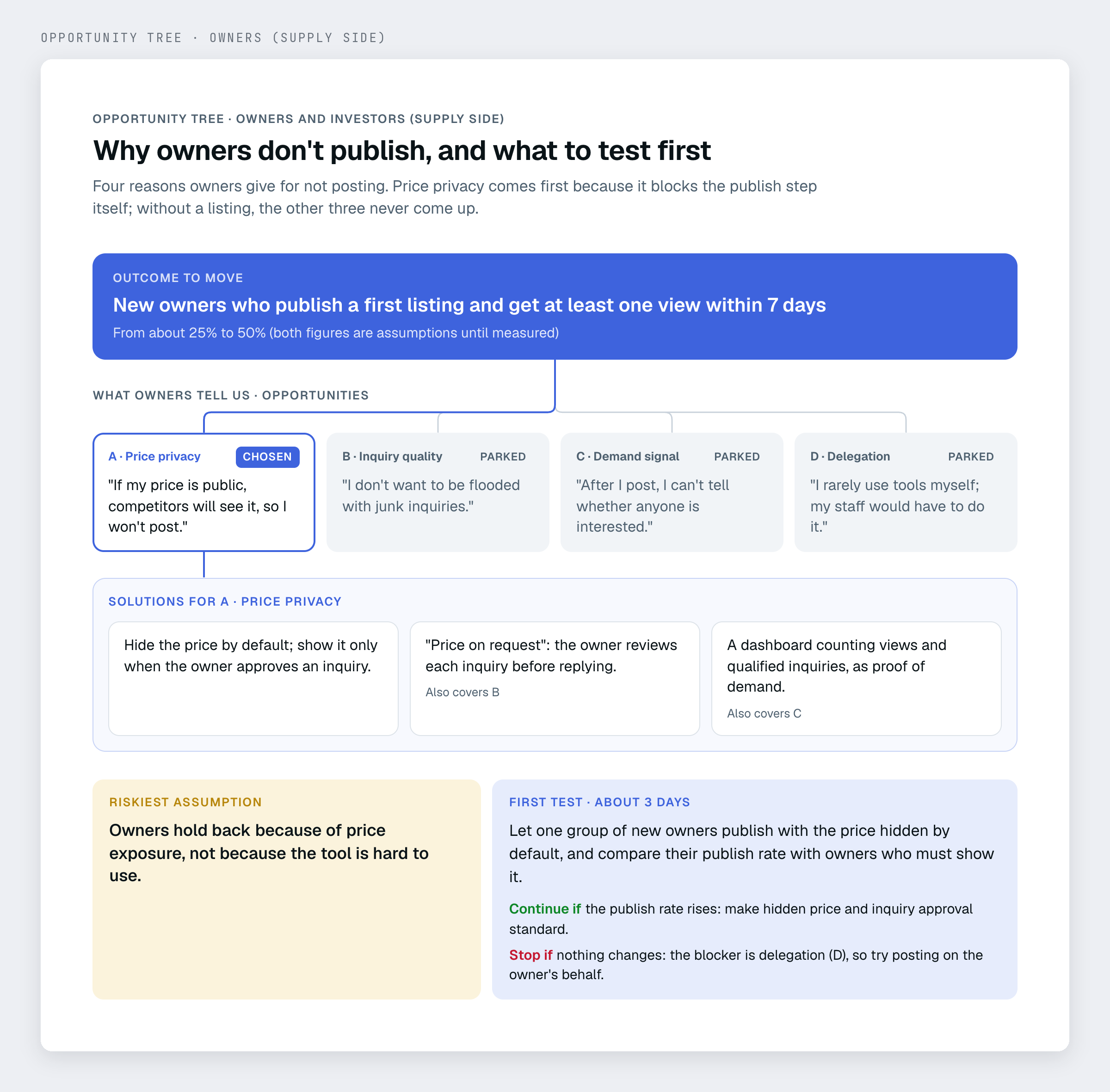
Map the opportunities, then name the riskiest assumption. For each side I listed the needs and fears behind a drop-off, chose one opportunity, sketched three solutions, and wrote a small proof of concept with criteria to continue or stop. For owners, the riskiest assumption is that fear of exposing the price, not usability, is what stops them publishing.
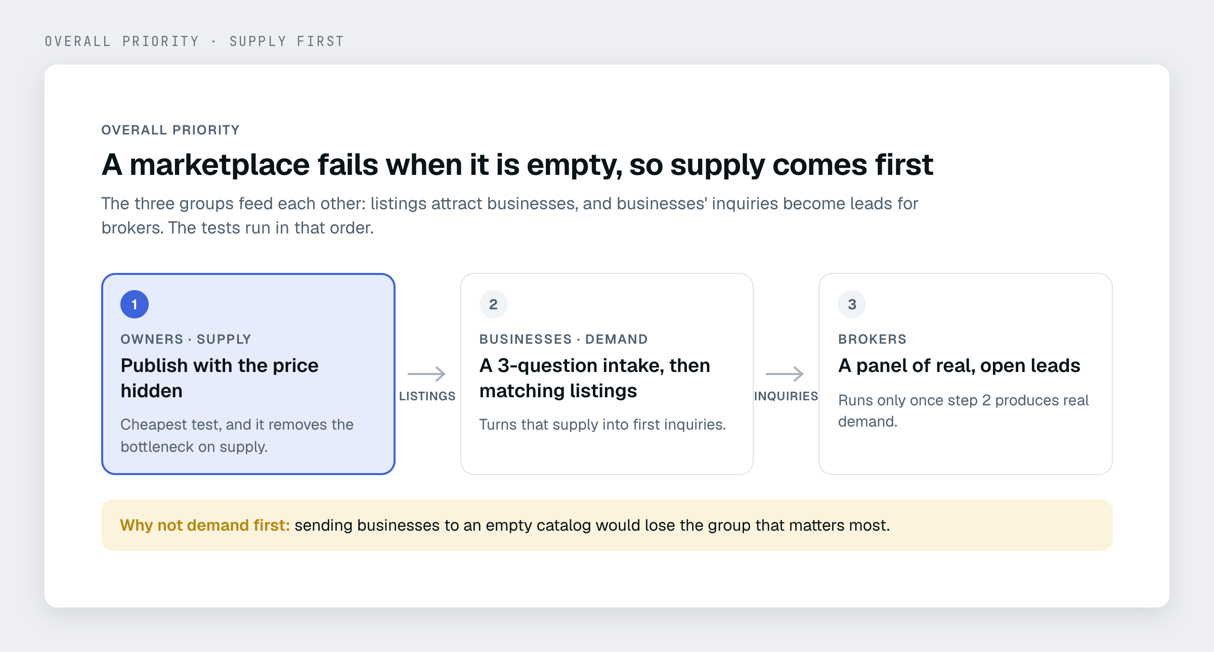
Seed supply first. The three trees depend on each other: businesses leave when listings are empty, and brokers need real listings to work with. So the tests start with owners, letting them publish with the price hidden, then turn listings into inquiries, then show brokers real leads.
Give owners control over what goes public
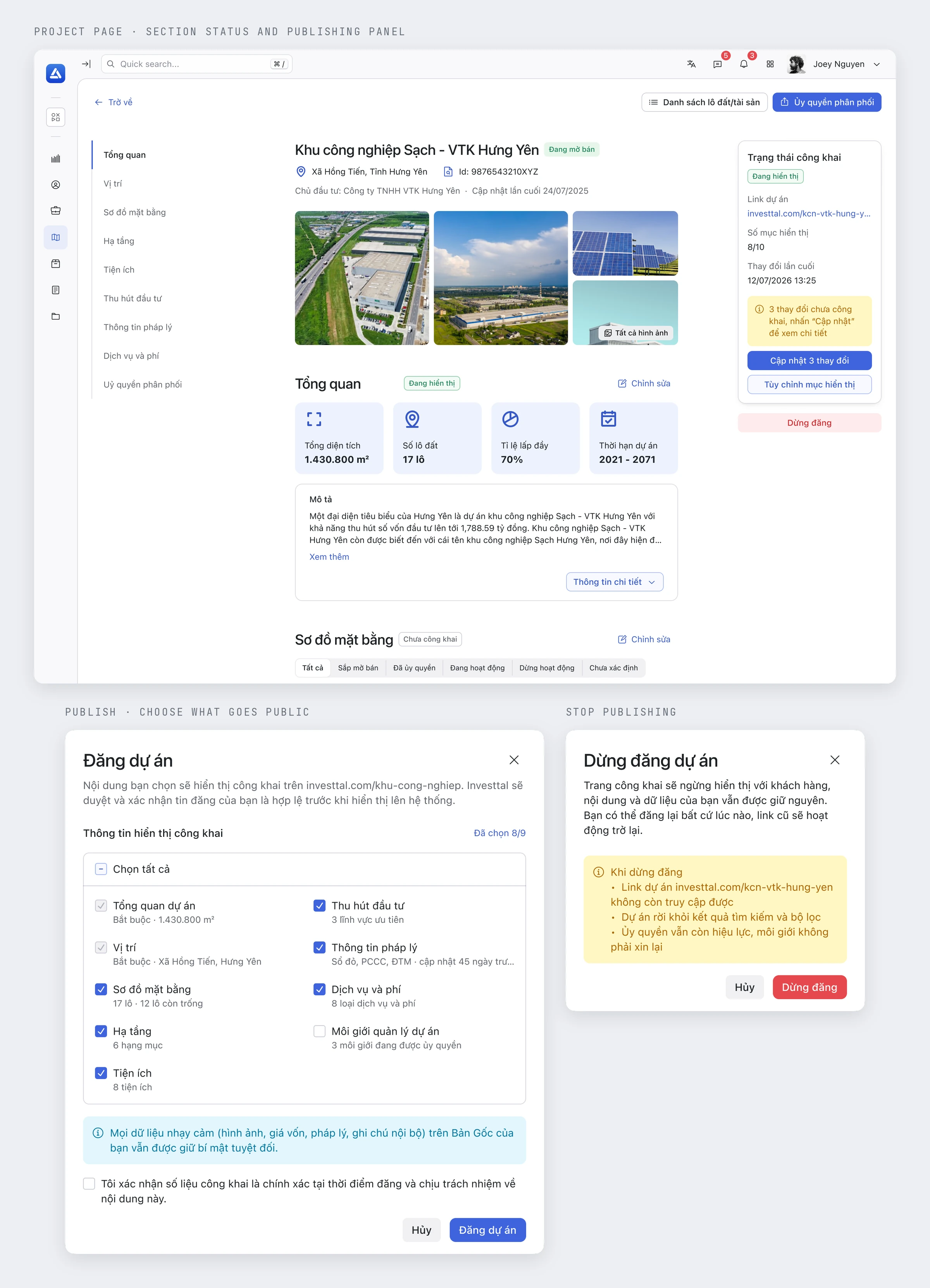
Choose what goes public. Each section of a project page is tagged live or unpublished, and a panel counts the changes not yet made public. When publishing, the owner picks the sections that appear on the website and confirms the figures, while sensitive data such as cost price and internal notes stays private. Stopping takes the page offline but keeps its data.
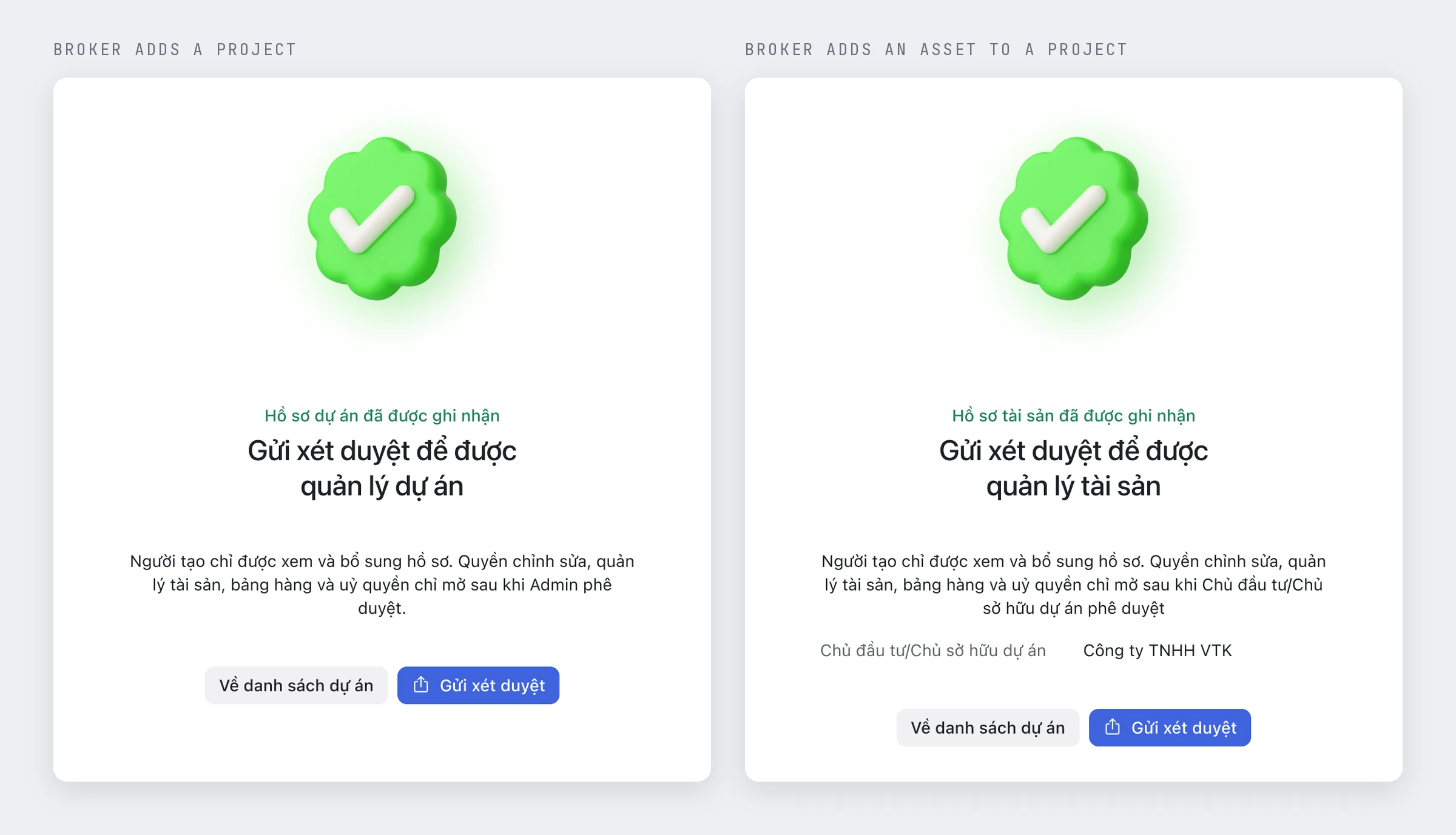
Match the interface to permissions. A broker who adds a project or an asset can view it and add documents; editing, asset management, and authorization open only after an admin or the project owner approves. The completion screen says so up front and names who will review.
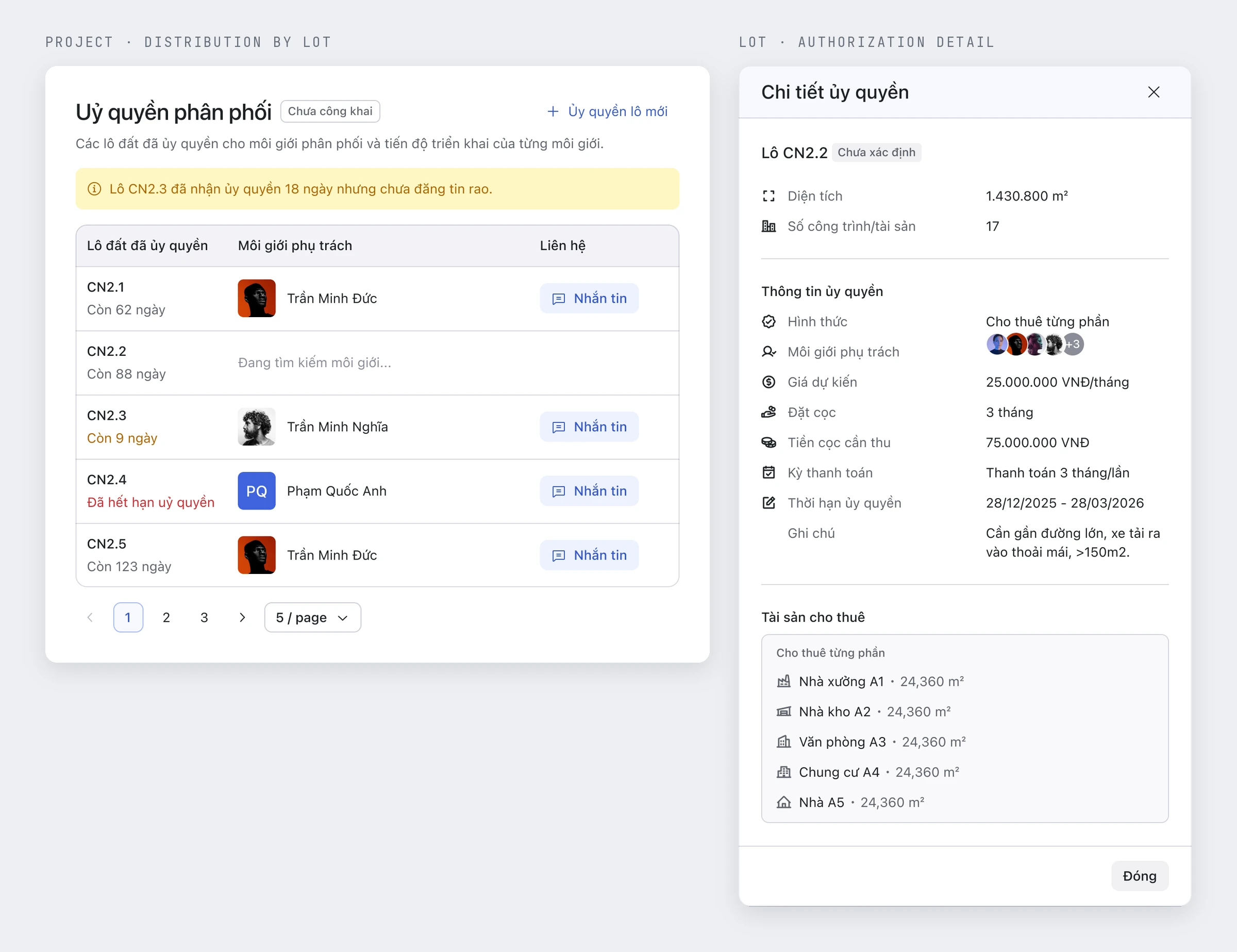
Hand lots to brokers, and keep the handover visible. Owners authorize brokers lot by lot, for sale or rent, whole or in parts, with a price and a time limit. The project page then shows each lot's broker and days left, warns when fewer than ten remain, and flags a lot that has been authorized for 18 days without a listing.
Two alternatives for this overview, and the reasons for dropping them, are kept in the decision notes.
Point each role to a first step, then carry the deal through
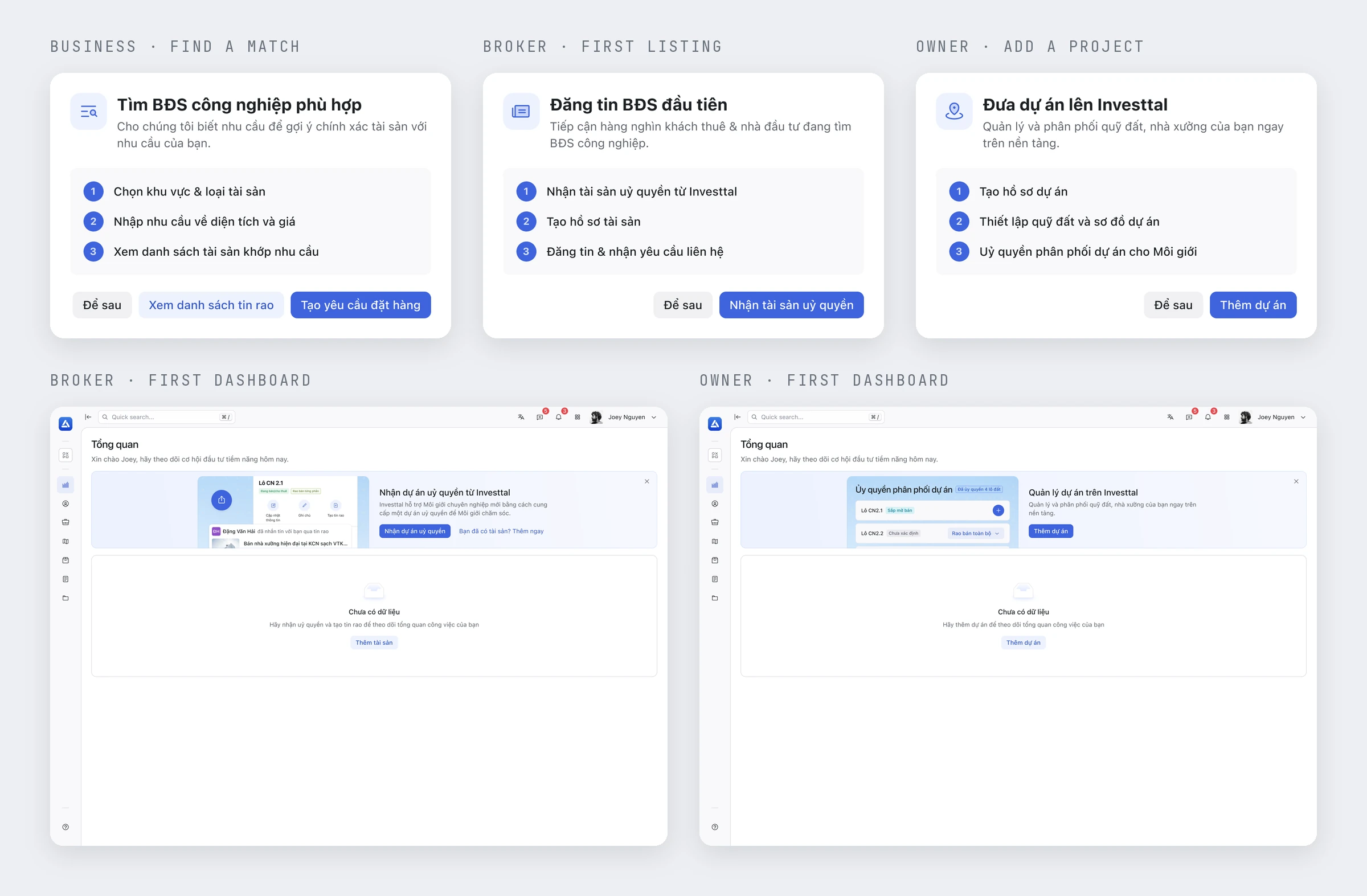
A first step for each role. Right after sign-up, a popup points each role to its activation event: businesses describe what they need, brokers take on an authorized project, owners add a project. Until there is data, the empty dashboard leads with the same step.
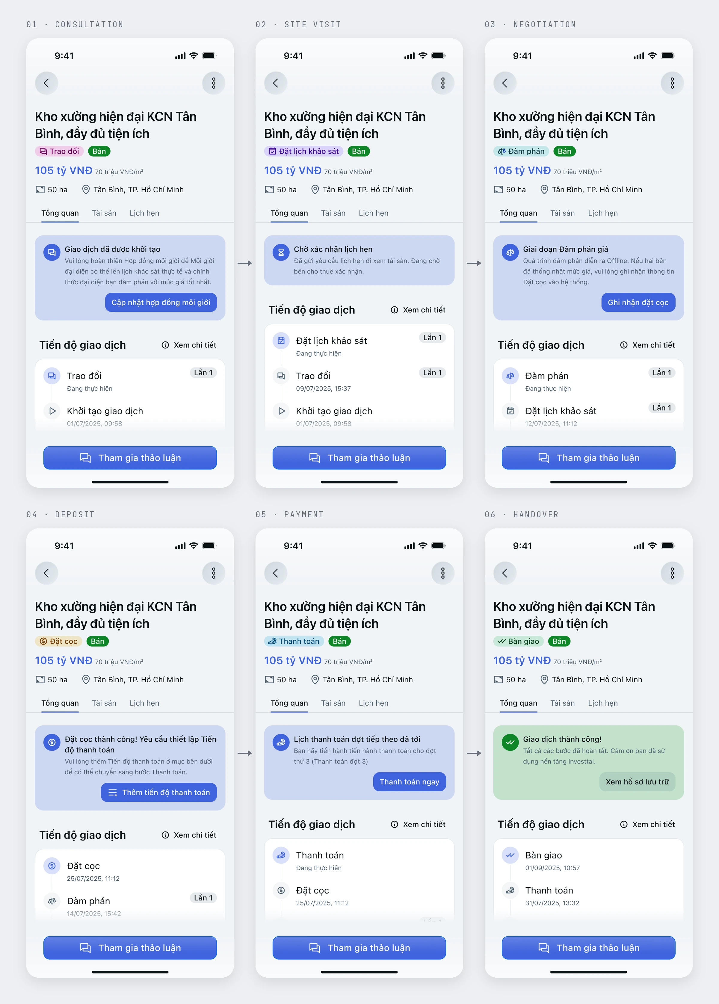
One screen for the whole deal. A deal moves through seven stages, from creation to handover. The deal screen stays the same; the banner at the top changes with the stage and names the next action, such as updating the broker contract or recording the deposit.
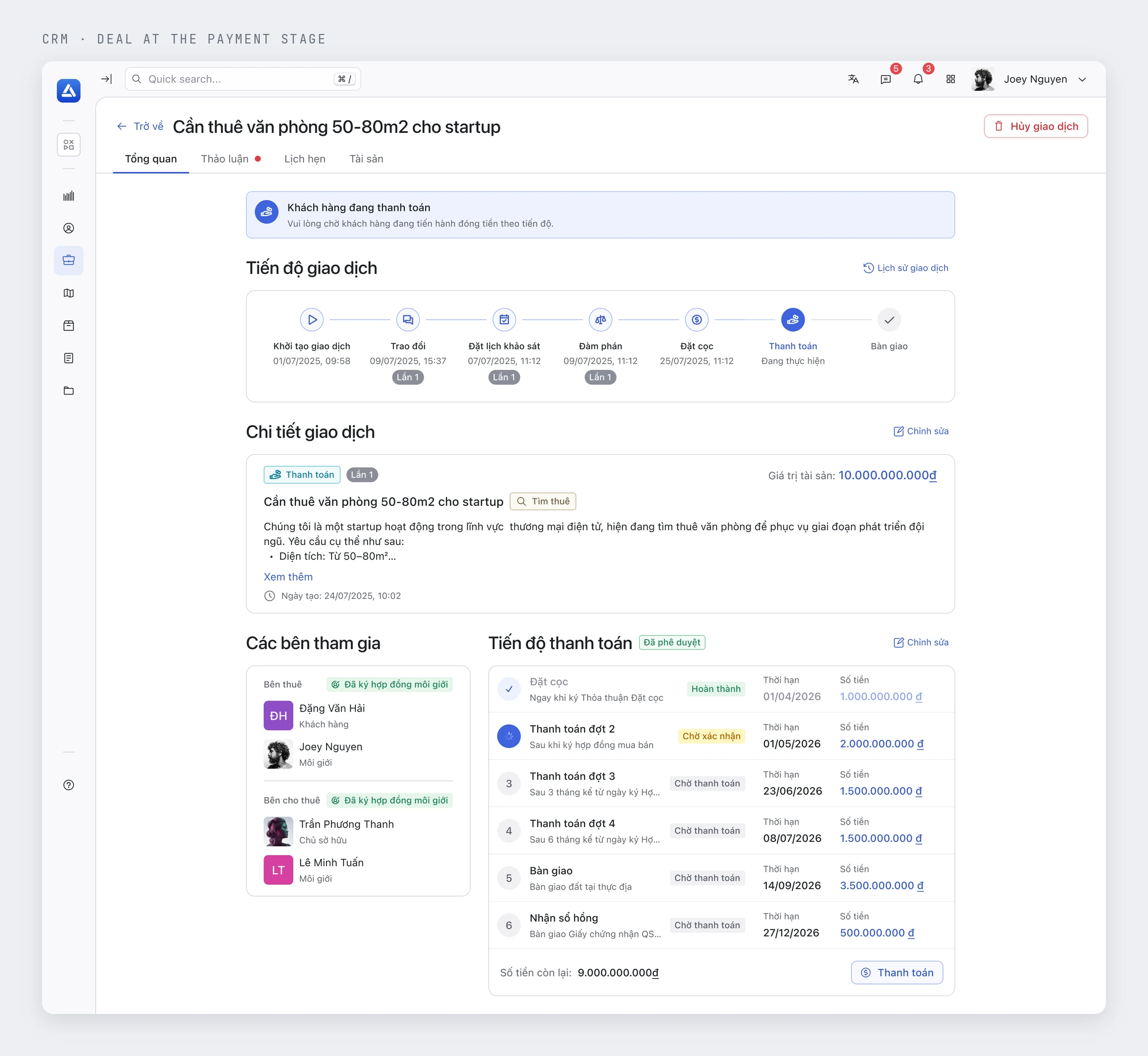
Show where the money stands. At the payment stage, a deal lists each milestone with its due date, amount, and status (completed, awaiting confirmation, awaiting payment) and shows the balance left, so both sides can see what has been paid and what comes next.
One system for web and mobile
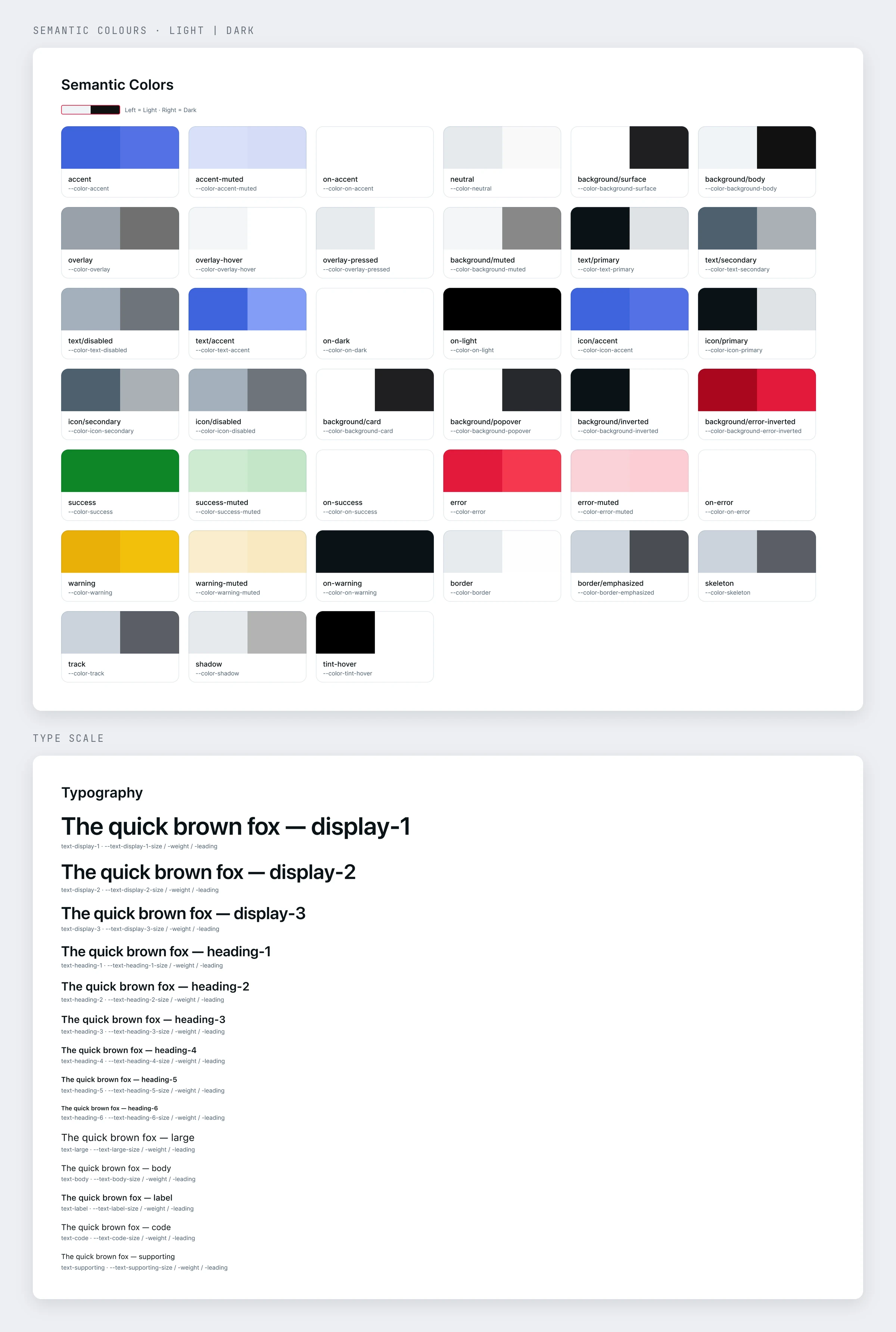
Shared tokens, different density. The website, CRM, and mobile app use the same semantic colors, type scale, and light and dark values. The website stays open and image-led; the CRM uses compact controls, aligned numbers, and status colors for scanning tables.
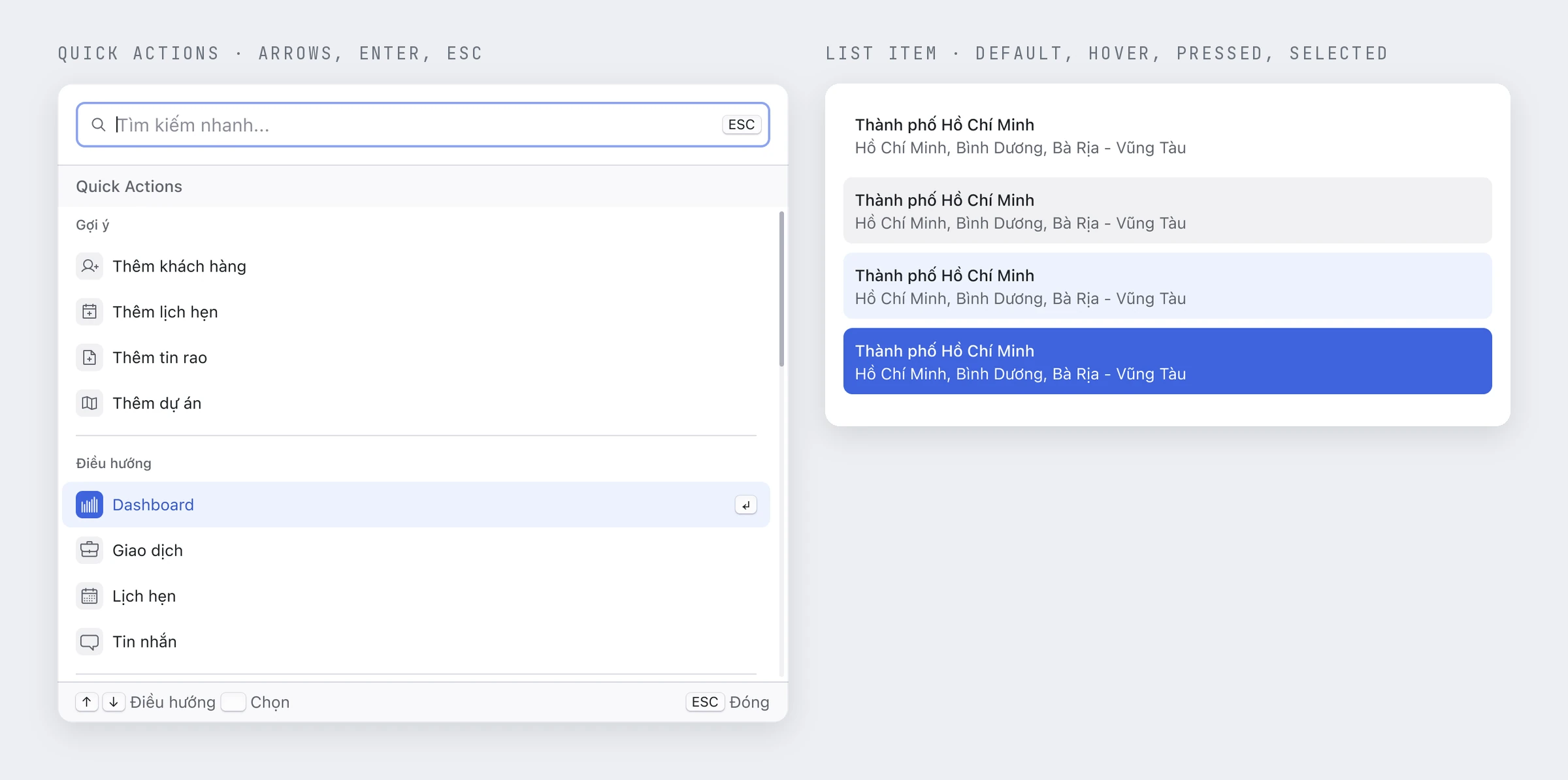
Keyboard and states before handoff. Handoff requirements include keyboard operation, visible focus, names for icon-only buttons, and dialogs that close with Escape. The quick-action palette shows its keys, states carry cues beyond color, and mobile touch targets are specified at 44px.
From Figma to a native app and shared code
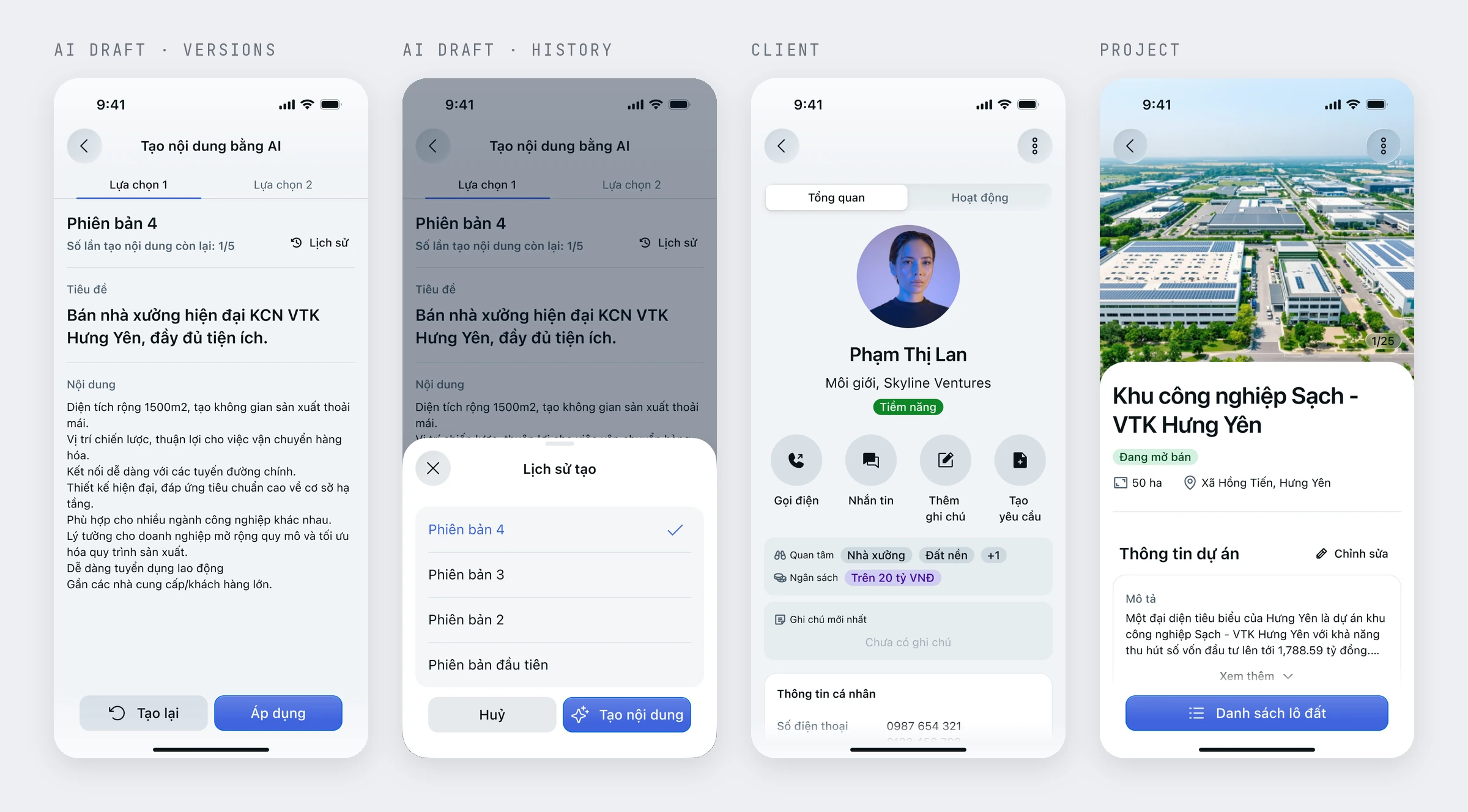
I was responsible for product design from the start and kept the Figma files and decision notes current across more than 60 feature areas. The broker app has its own Figma file, designed for native iOS and Android rather than shrunk from the web. Its AI listing drafts come as numbered versions with a limited number of generations and a history, and nothing changes until the broker applies one.
I also contributed code to the design system, where tokens sync into a React component library documented in Storybook. When I left, the product had no users yet, so there are no outcome figures; the next step I handed over was running the three proofs of concept from discovery.
Plenty of information, hard to find
GP Academy is a bilingual preschool group in Hanoi, part of GP Invest. Its website needed to cover several campuses, two program tracks, and five age groups, alongside English learning, the GrapeSeed club, nutrition, and healthcare.
On the previous WordPress site, campus information, programs, and specialist articles were mixed together. Parents had to work through a lot of content to find what was relevant to their child's age.
I handled the UI/UX design for this project myself. Working with the existing brand identity, I reorganized the content and developed a consistent layout system for the website.
Start with how parents look for information
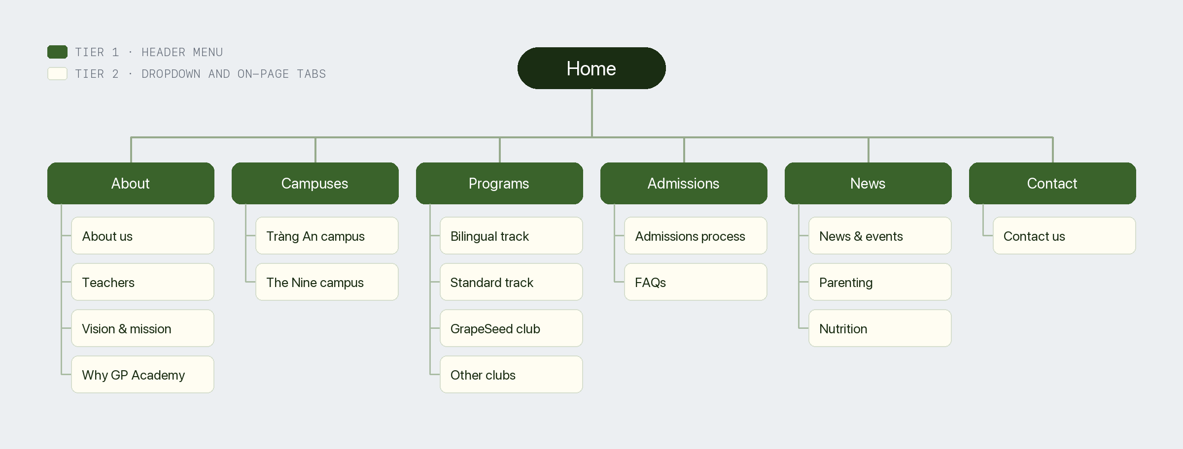
I organized the content into six groups with two-tier navigation. Parents could choose the type of information they needed before opening individual pages.
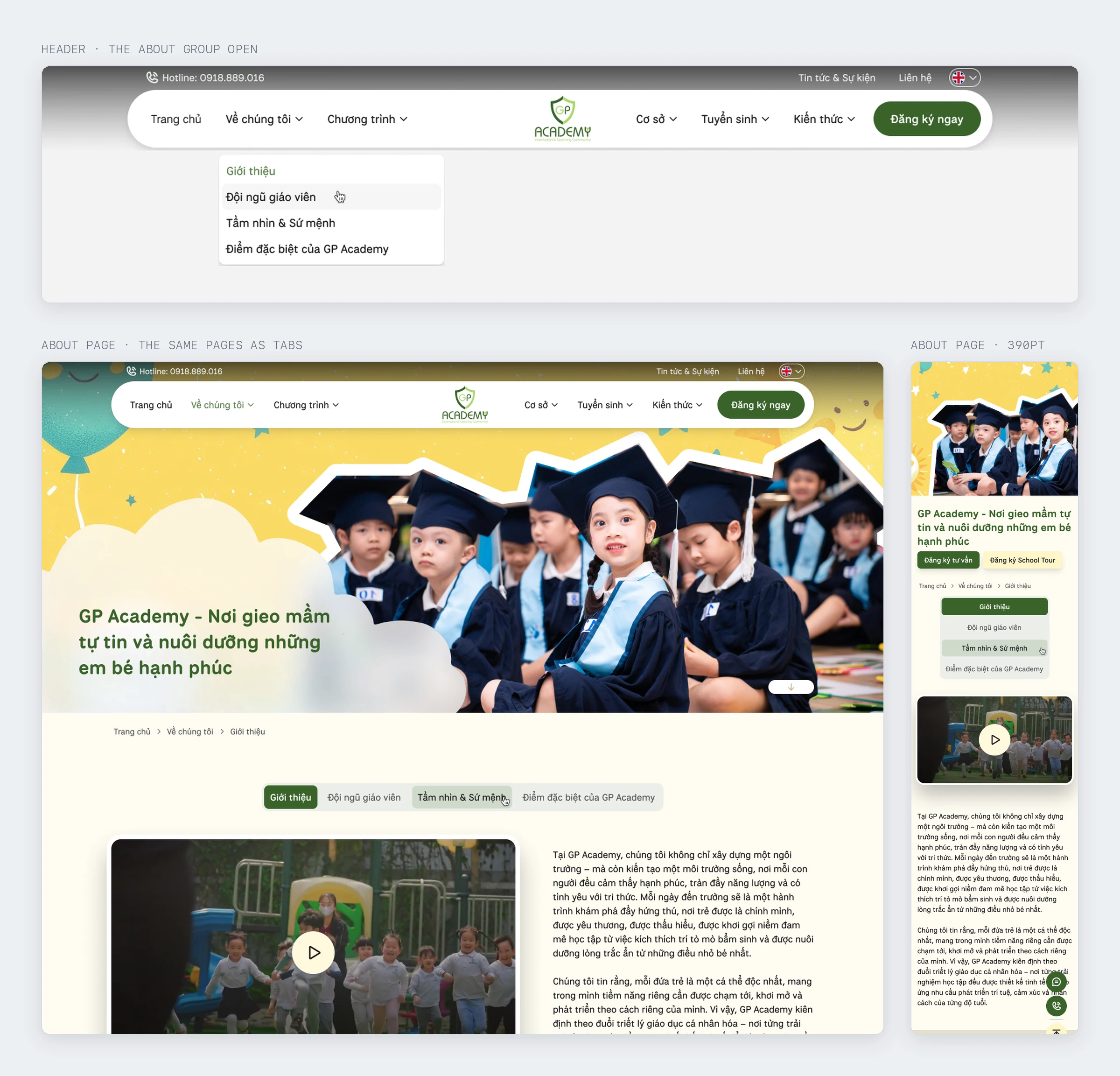
Give campuses their own navigation. Parents can find a school by location while the main program navigation stays manageable.
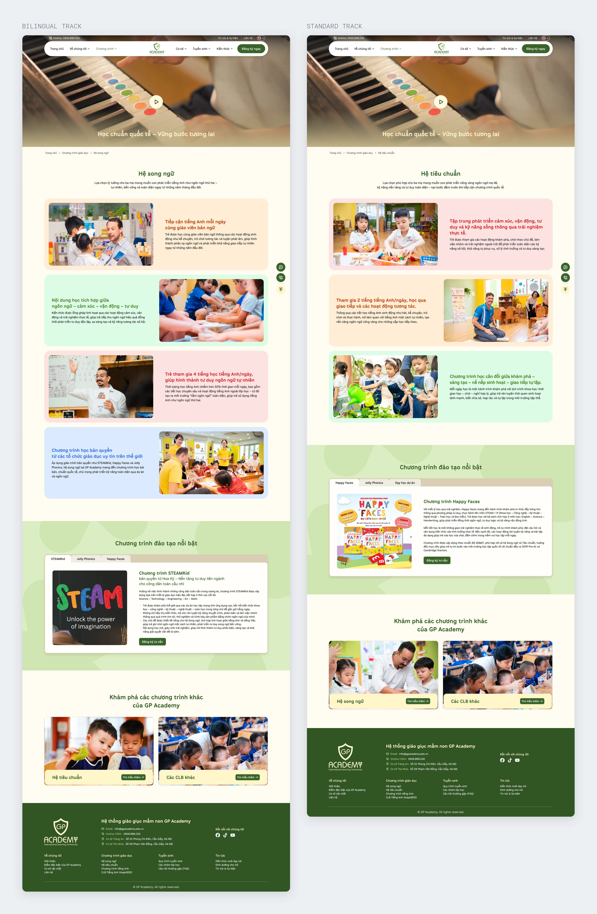
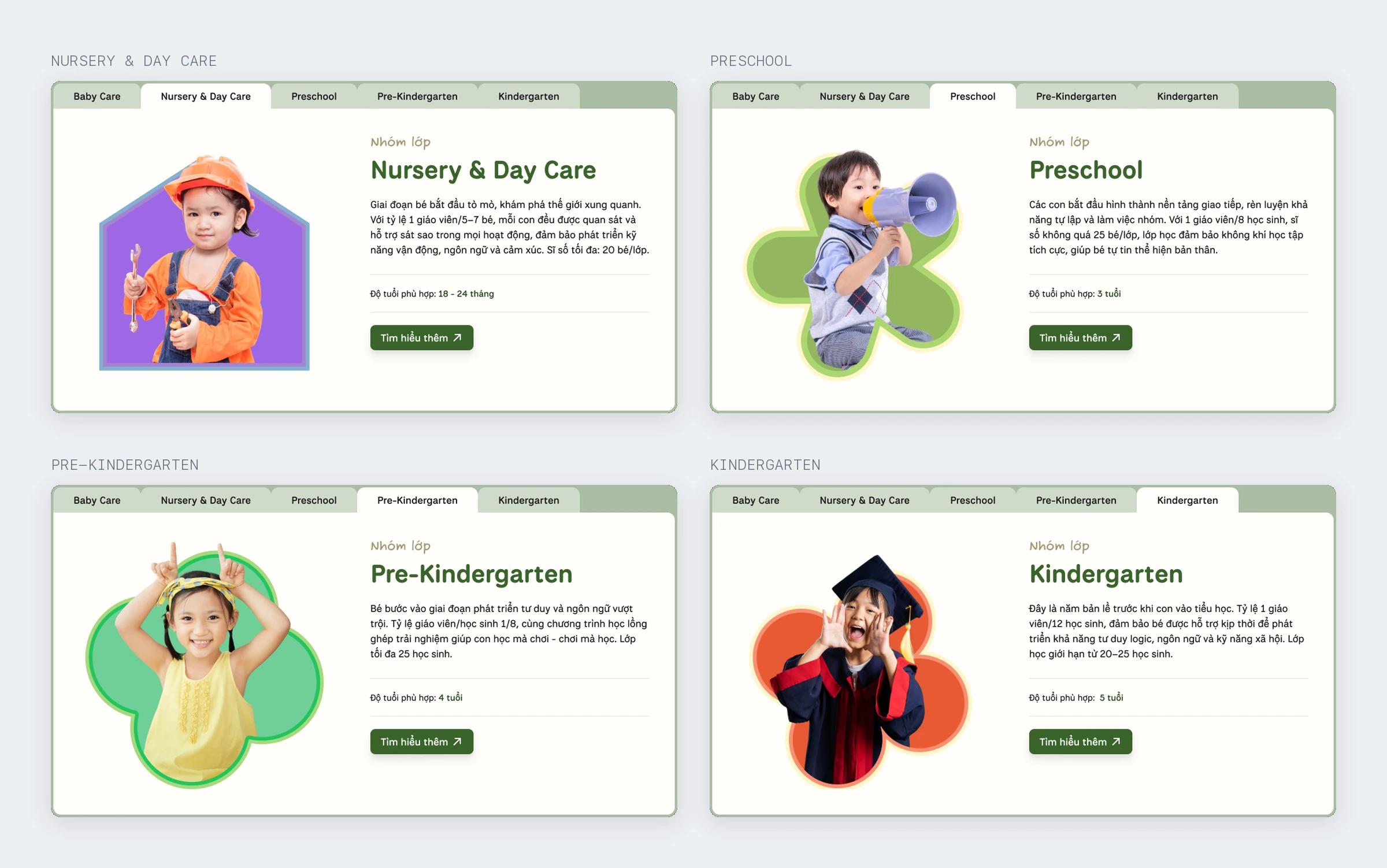
Use one page template for both program tracks. Each page presents age groups as information cards. Parents can browse age-specific programs in one place, and the school can add content within the same structure.
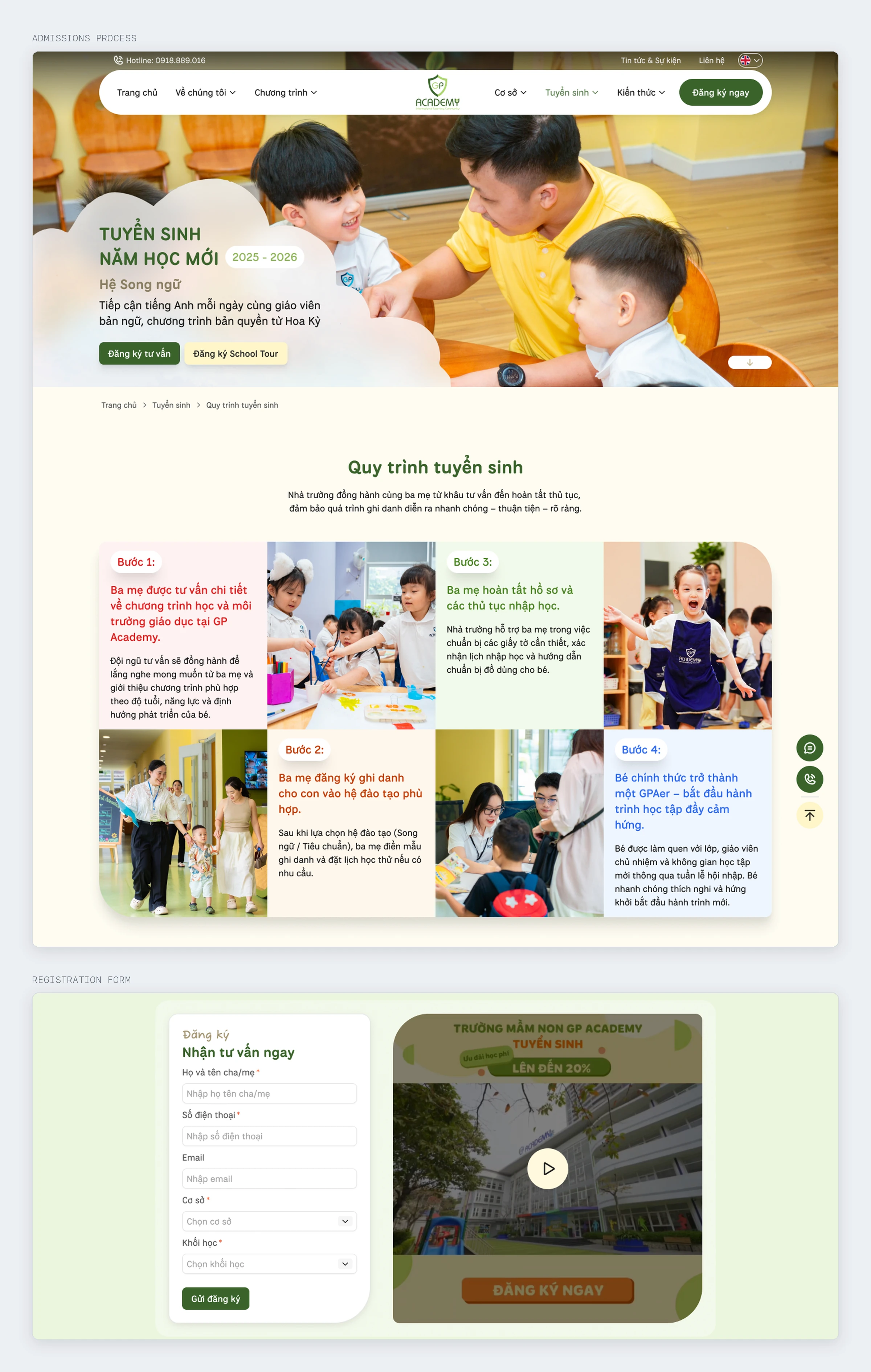
Separate specialist content from admissions. Parenting and nutrition have their own categories. The admissions page explains each step, with consultation and school-tour buttons leading to the registration form.
Build on the existing brand identity
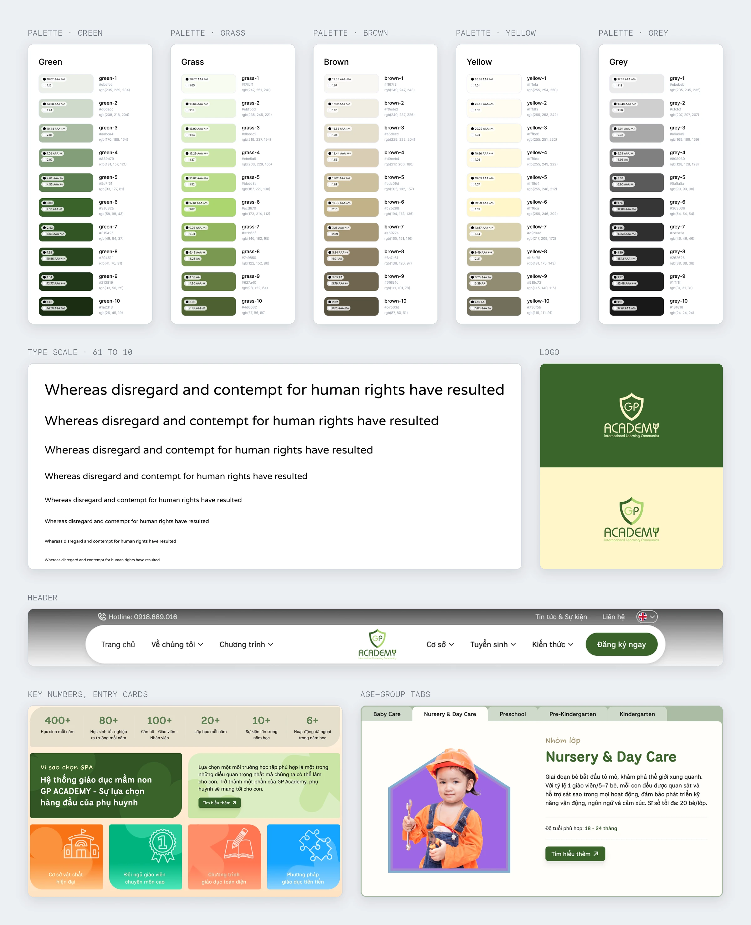
I used the brand's colors and typography as the basis for the interface system. Shared values became design tokens, supported by a component library for use across the site.
- Colors and typography: consistent usage and type hierarchy across pages.
- Shared components: navigation scroll states, tabs, age-group cards, forms, and registration buttons.
- Page templates: room for additional campuses or programs within the existing structure.
I also reviewed the brand materials to decide how imagery and color should be used, then documented those choices in the shared guidelines.
About 20 pages for desktop and mobile
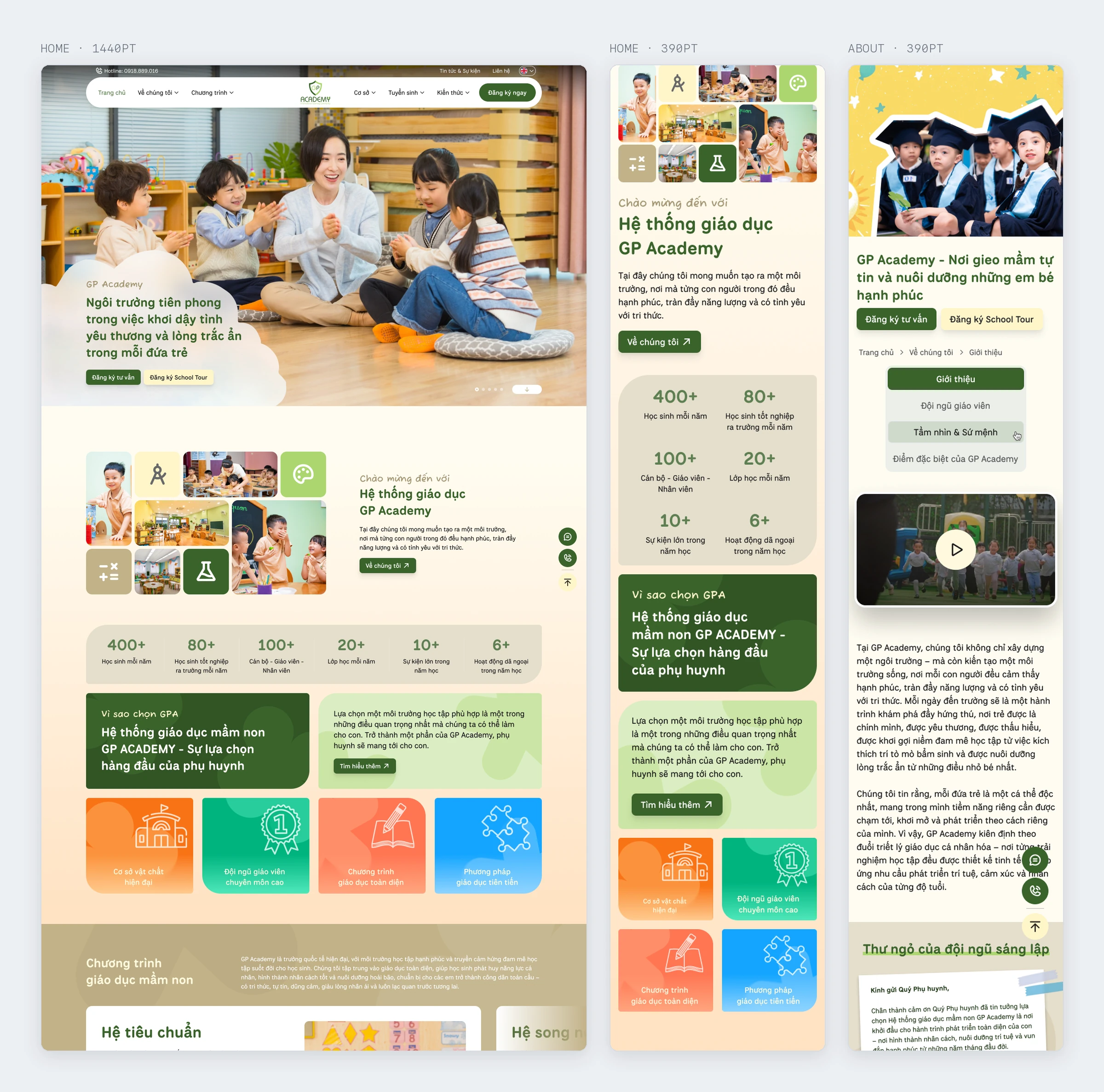
The scope covered home, about, vision and mission, teachers, programs, the GrapeSeed club, campuses, admissions, news, specialist categories, FAQs, and contact. Pages were designed for desktop at 1440px and mobile at 390px, in Vietnamese and English.
I used the homepage to establish layout, spacing, and registration-button placement. The other pages followed the same rules, with adjustments for their content.
The website was launched
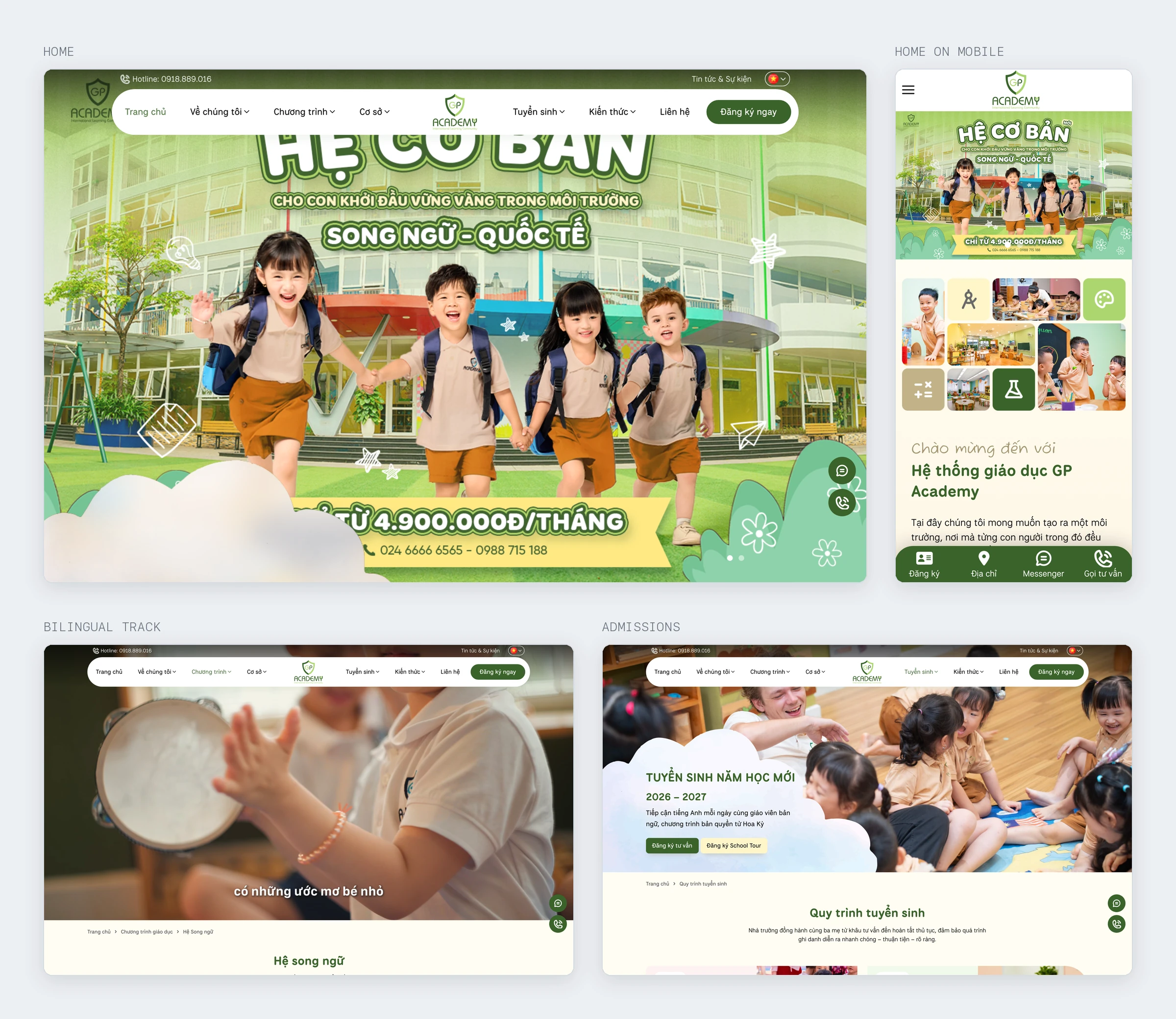
The website was launched at gpacademy.com.vn. The design aimed to put age-relevant information within two clicks through the navigation and program-page structure.
I don't have post-launch analytics, so I can't assess changes in registrations or how parents found information. The work presented here focuses on the completed content structure and interface design.
An early content structure made design easier
Agreeing on the sitemap and program template early made later content requests easier to handle. Age groups had a place in the shared layout, so content changes didn't require redesigning individual pages.
If I did this again, I'd finish the design tokens and component library earlier. Building them alongside the first pages meant going back to revise work I'd already drawn.
Bringing several tools into one platform
Bizfly Customer Platform was designed to bring Bizfly's customer management and engagement tools into one web app. The designs targeted desktop at 1440 × 900px. The project was later shelved before release.
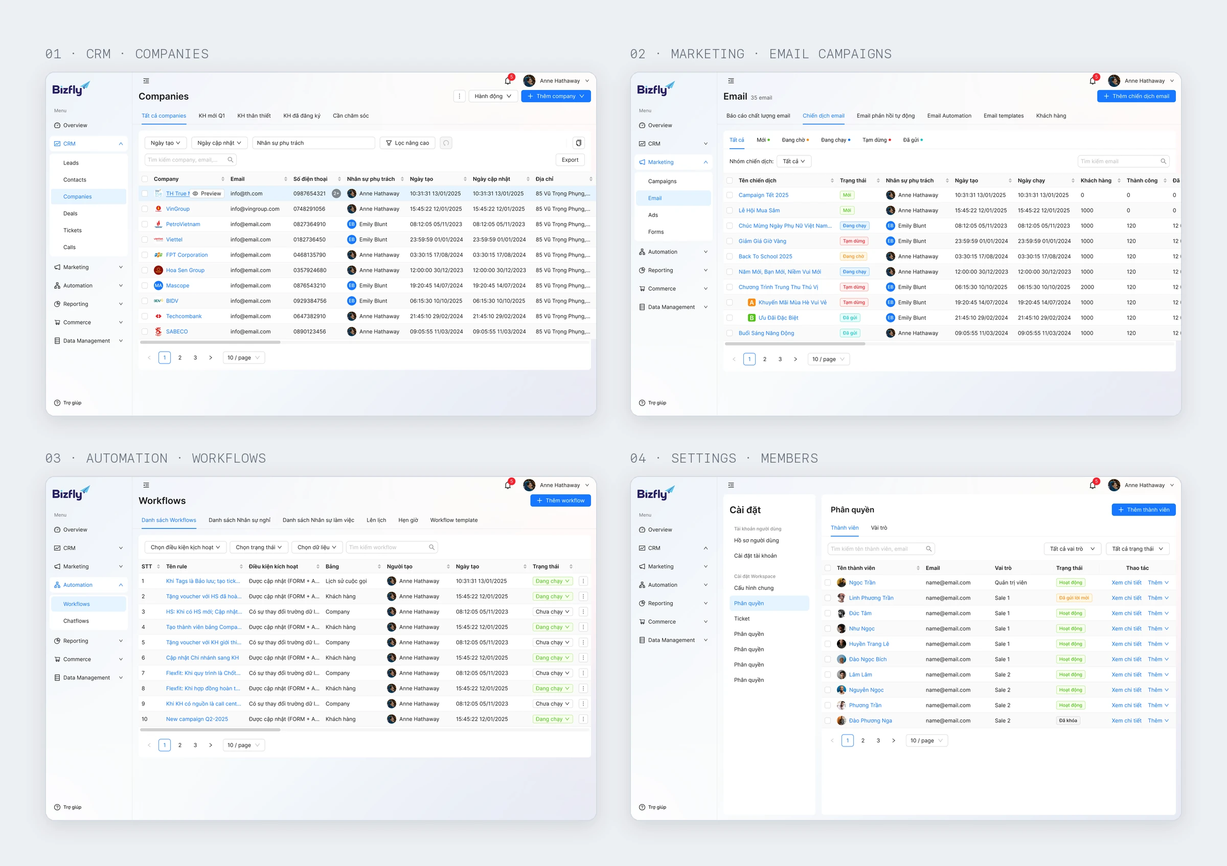
Each module had dense tables, forms, and processing states. Separate navigation patterns would force users to learn their way around again whenever they switched tasks. Consistent behavior across modules was a priority.
The team had two people and three months to complete the design. We needed to use existing components and identify shared patterns early.
Agree on shared patterns first
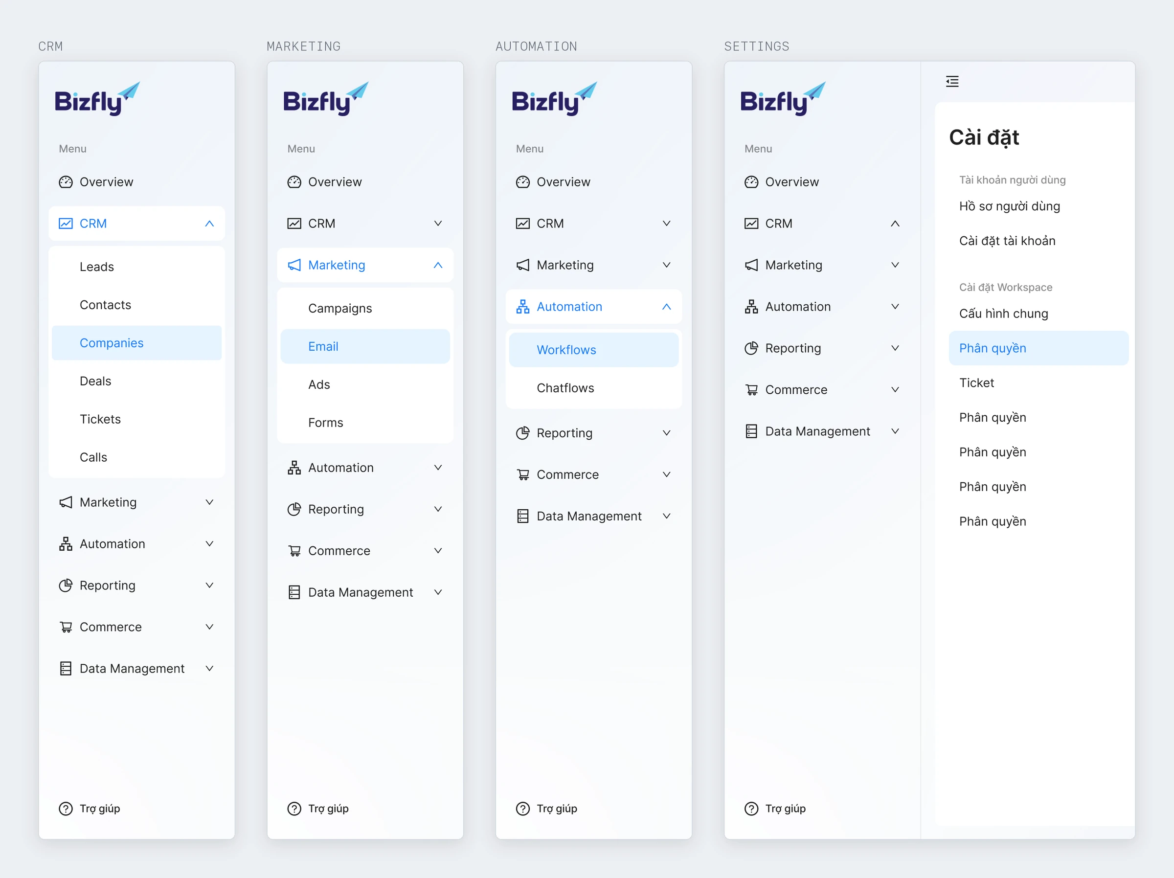
We started with the app's navigation and shared flows. When we moved into individual modules, both designers worked within the same navigation structure, including areas outside my own scope.
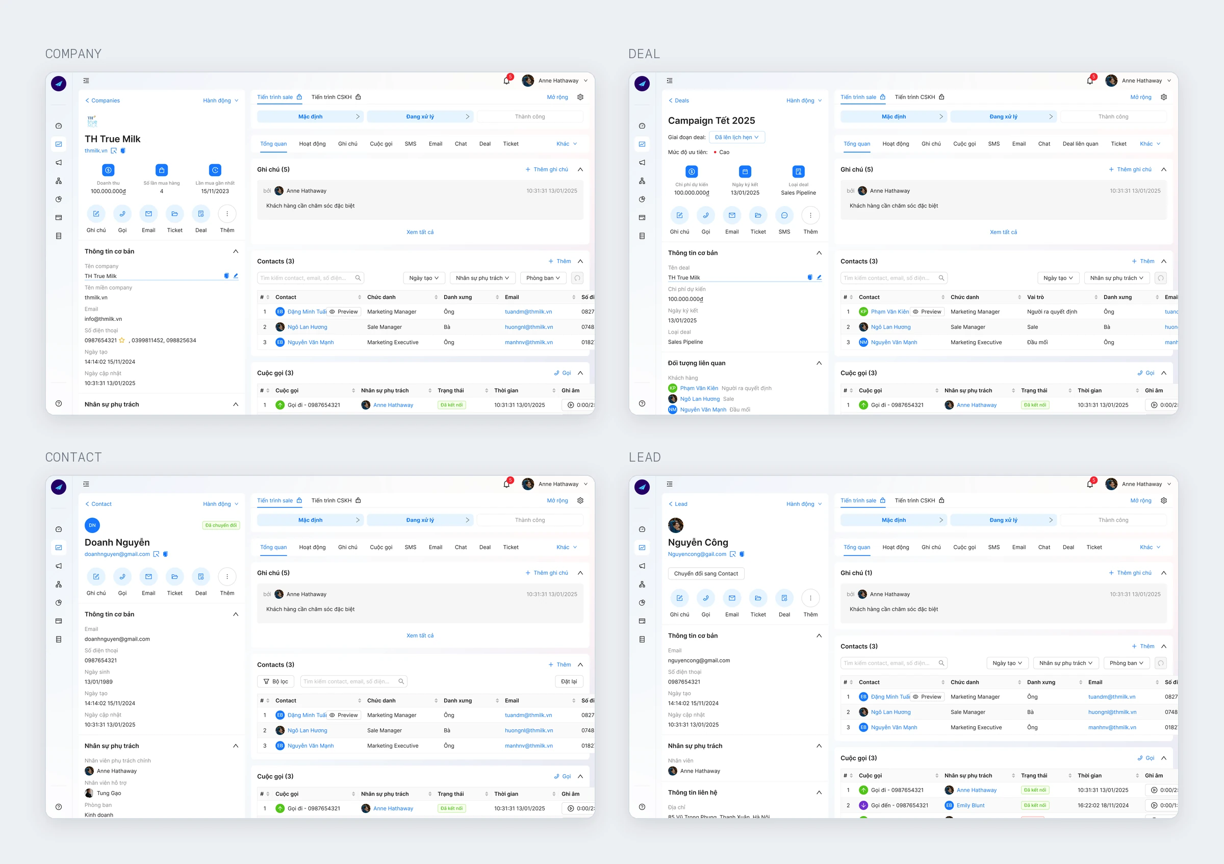
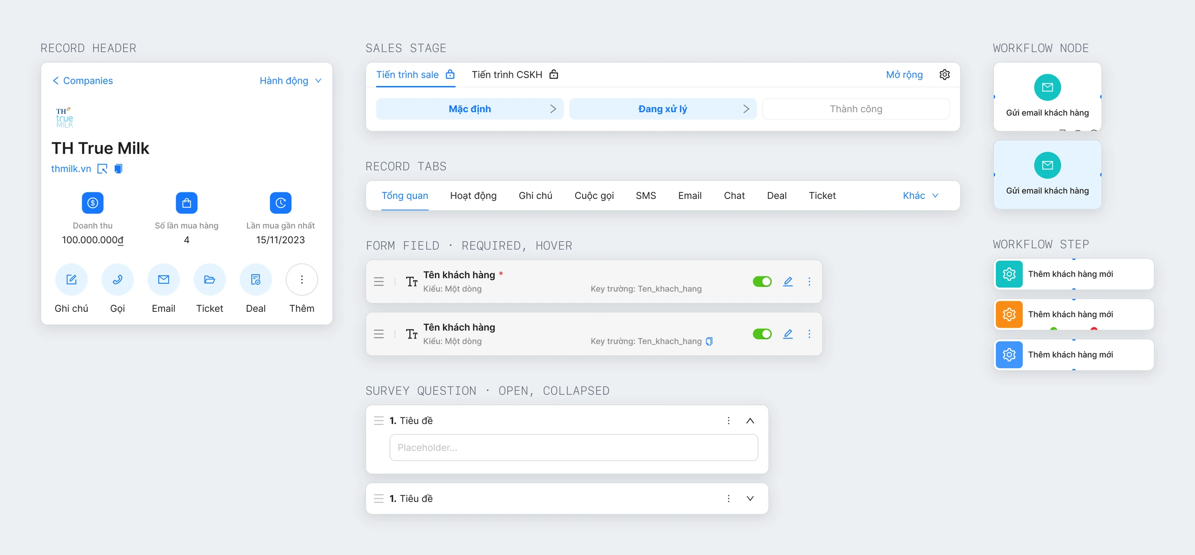
Share the record-page template. Company, Deal, Contact, and Lead used the same basic layout, with content adapted to each record type.
Build on Ant Design. We used the library's basic components and customized the parts that needed to support specific workflows or Bizfly's visual identity.
Automation alone had 52 design frames. These covered workflow lists and details, schedules, staff availability, leave, logs, and templates. Shared layouts helped the team cover that scope within the deadline.
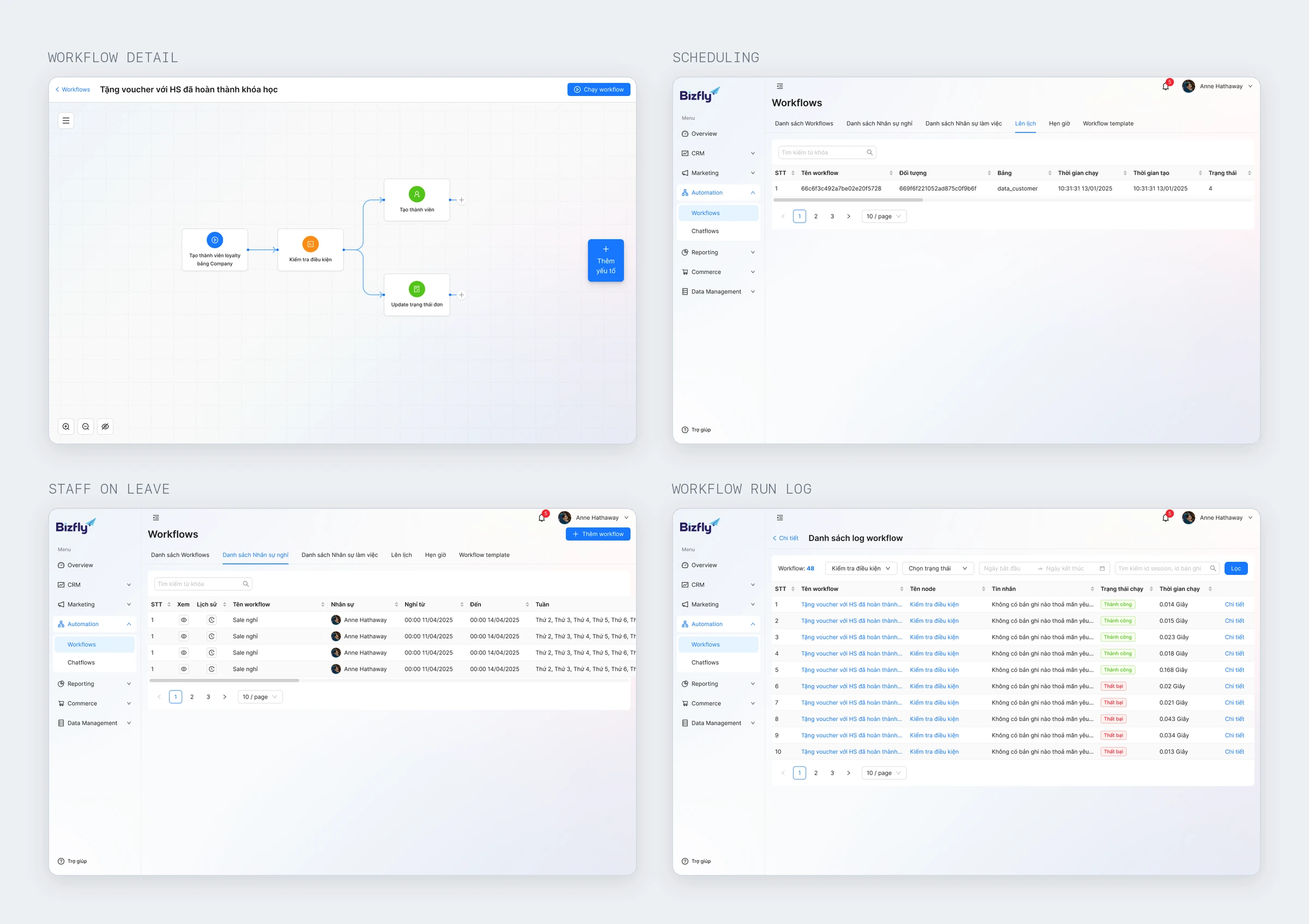
Three problems across CRM, Marketing, and Automation
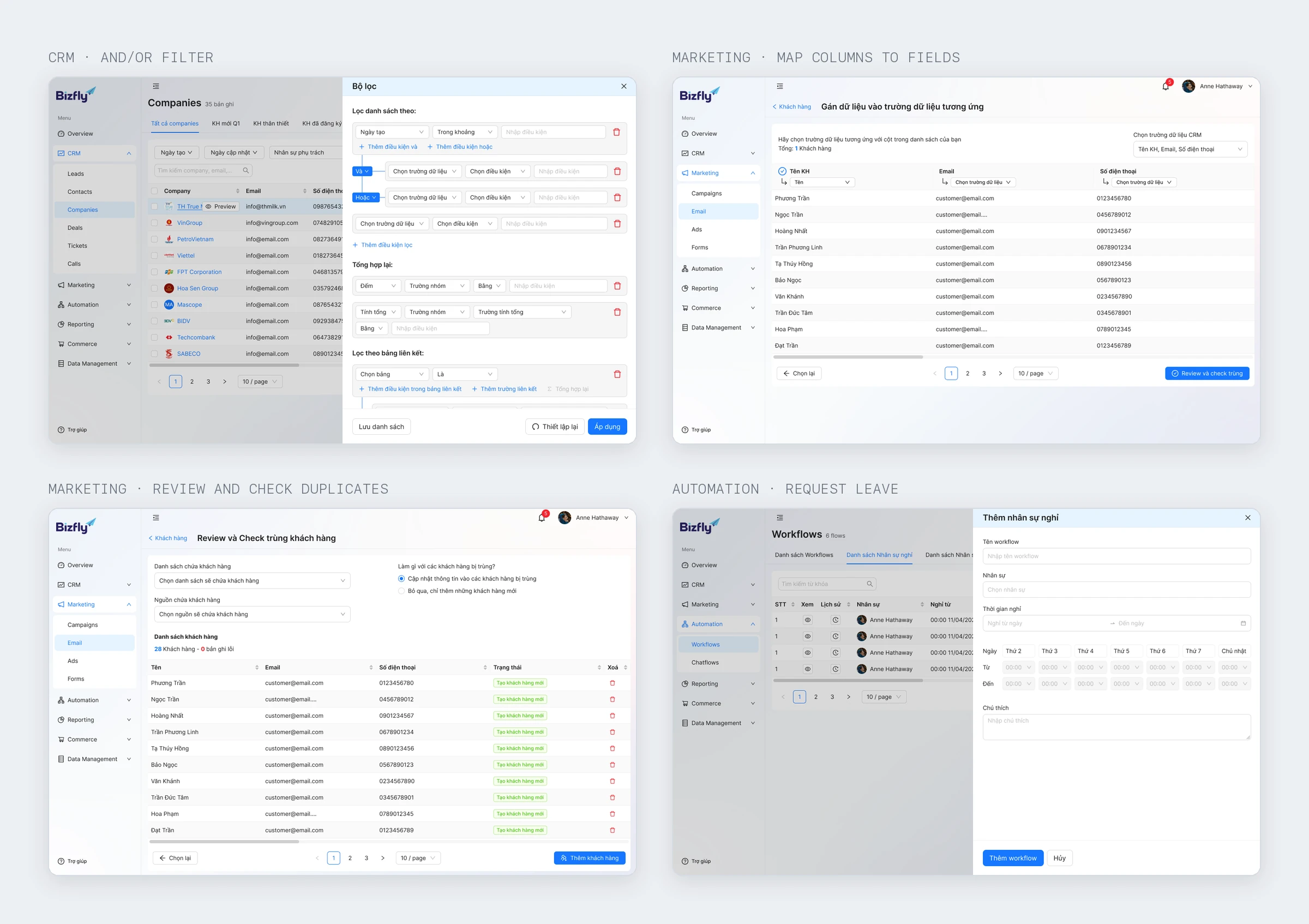
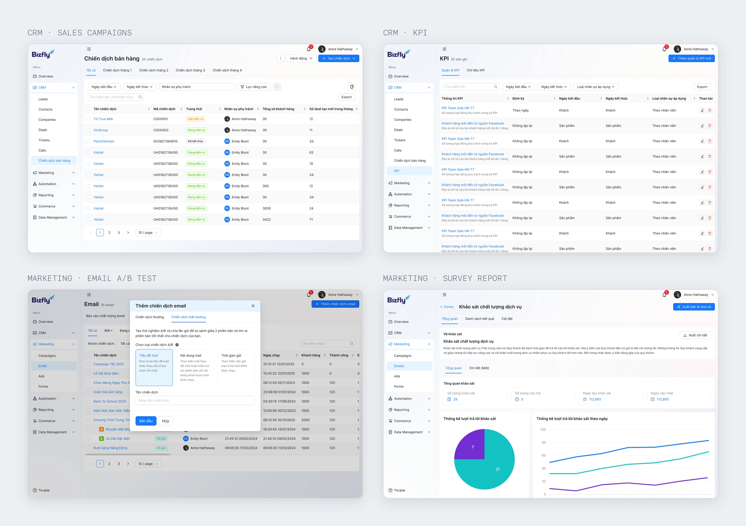
Each module had its own requirements beyond the shared interface. I focused on filtering directly in a list, checking data before import, and showing which staff were available for work.
- CRM: filter directly in the list. The Company list had many data fields. I designed a filter with field selection, AND/OR conditions, and saved filter sets. It required more controls, but users could build a query where they were already viewing the data.
- Marketing: review lists before importing. Within Email, users mapped columns to fields, reviewed the data, and checked for duplicates before saving. The extra step made the flow longer but helped catch mistakes before the list was used in a campaign.
- Automation: account for staff leave. I designed a leave-request flow within this module so administrators could see who was available. It supported automated workflows that included tasks assigned to staff.
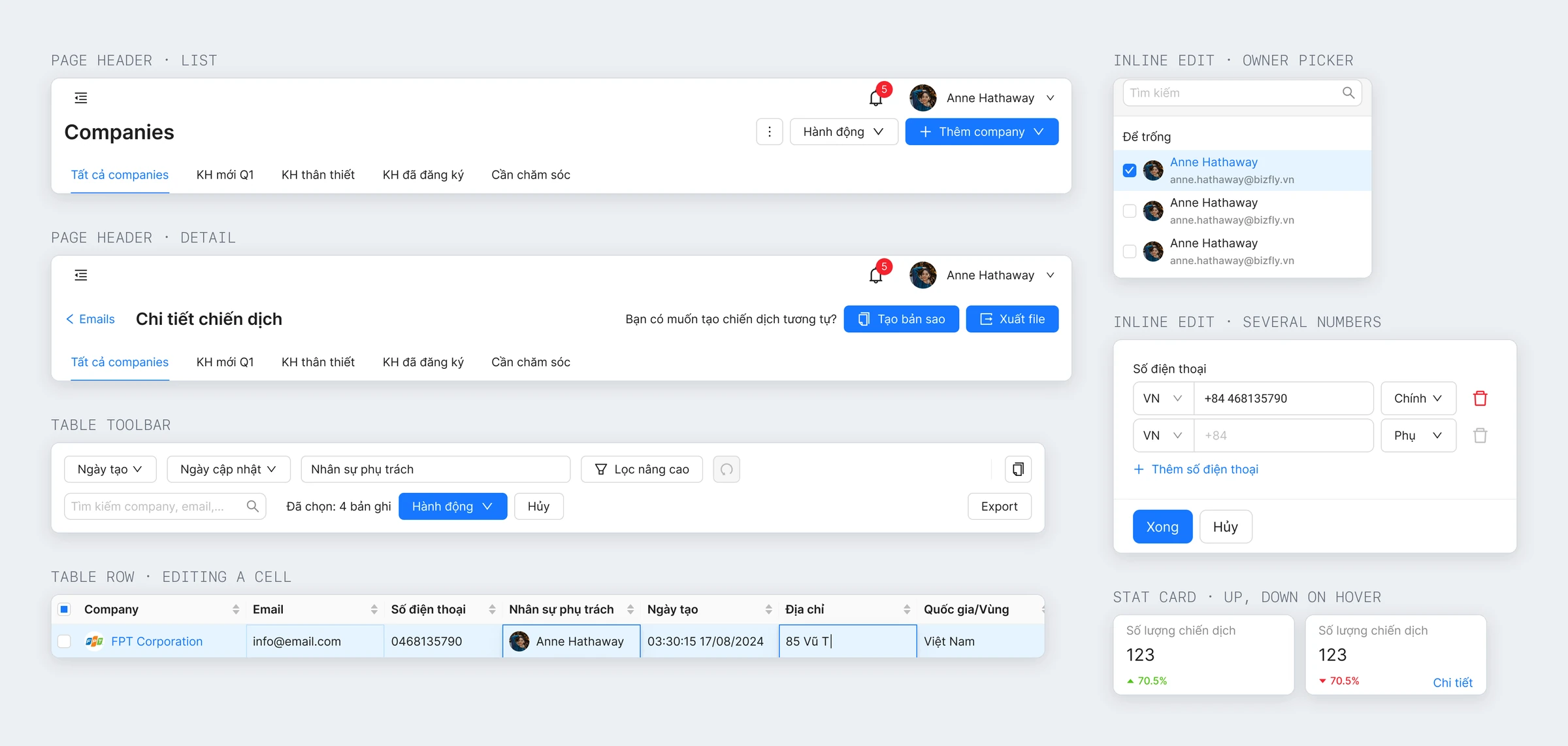
Adapting Ant Design for Bizfly
With three months available, the team chose Ant Design as the interface foundation. I focused on combining its components and applying Bizfly's identity to the screens we needed.
- 22 component sets were built for the project using Ant Design's basic components.
- Brand colors were defined as shared values and applied consistently across interface states.
- Reusable patterns included navigation, tables and their states, forms, and record headers.
The existing library helped us design faster, but text colors, backgrounds, and interaction states still needed checking after customization. That's work I'd account for from the start when using a UI library.
Design completed; the project stopped before launch
The team completed the design, but a business decision stopped the product from being released. So I have no usage data to assess how the solutions performed.
The deliverable was a design for a multi-module platform completed in three months. Shared navigation, flows, and record-page templates let two designers work within one structure, with four modules in my scope.
Shared patterns helped us stay on schedule
Agreeing on navigation and shared flows before dividing the work reduced the chance of designing the same component in two different ways. For a small team covering many modules, that was the most useful decision.
If I did this again, I'd finalize brand colors and check contrast when setting up the library. Doing that early would reduce changes across finished screens later.
Designing an app for insurance workflows
BIC is BIDV's insurance company. The app lets customers buy insurance online, submit and track claims, make payments, and look up services included with their policies.
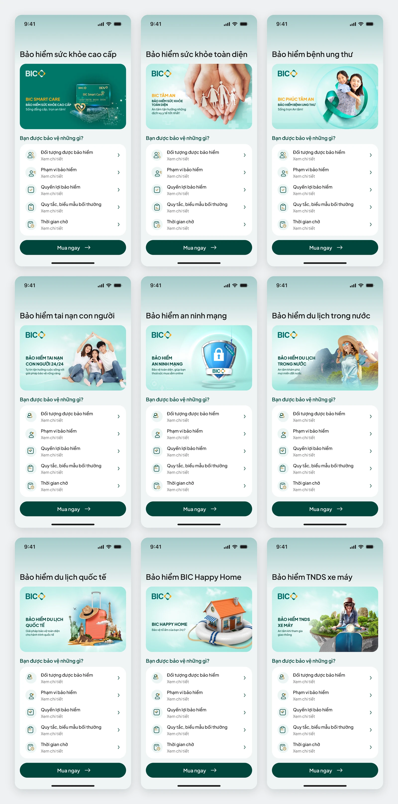
The first phase covered the home screen, insurance products, motor, health, and cyber claims, identity verification, the cart, renewals, accounts, and BIDV account linking. I also created a style guide to keep presentation and interaction consistent across these areas.
After the first version of BIC Online went into use, BIC continued working with Bizfly, and I was assigned to bring the insurance features into the BIDV app.
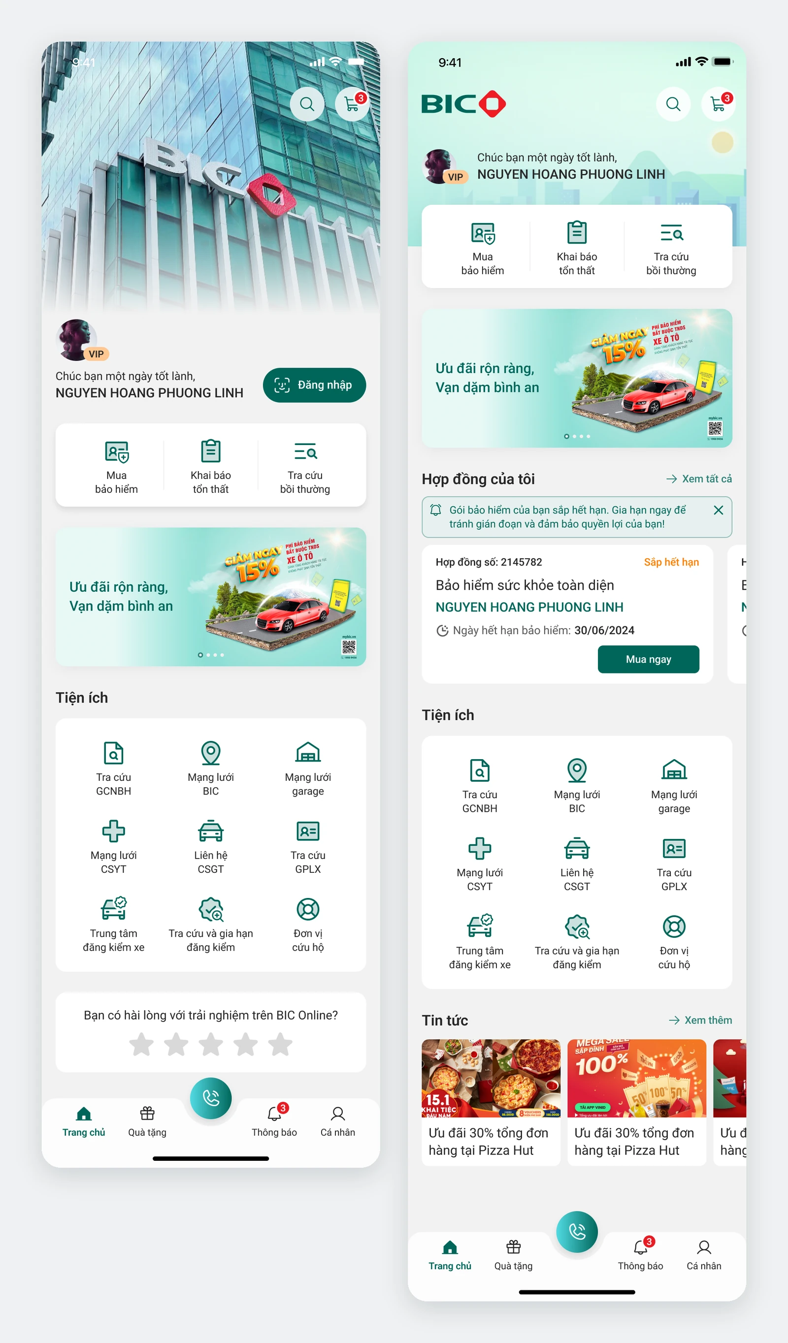
From a standalone app to the banking app
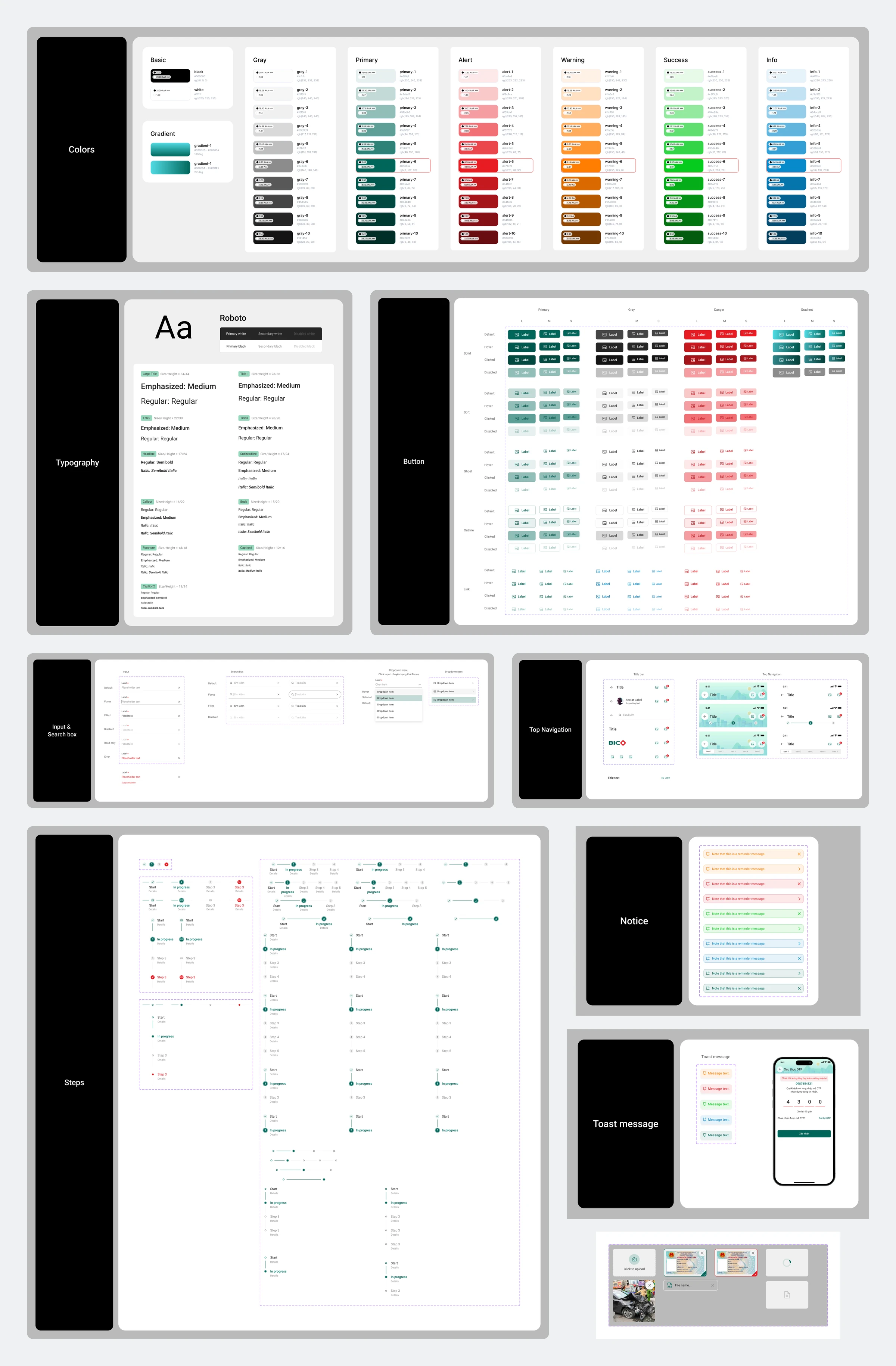
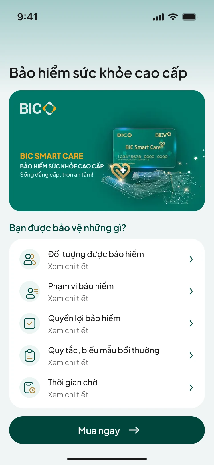
In the first phase, I designed BIC's standalone app and its style guide. The guide covered colors, typography, buttons, inputs, navigation, step indicators, image uploads, and notifications.
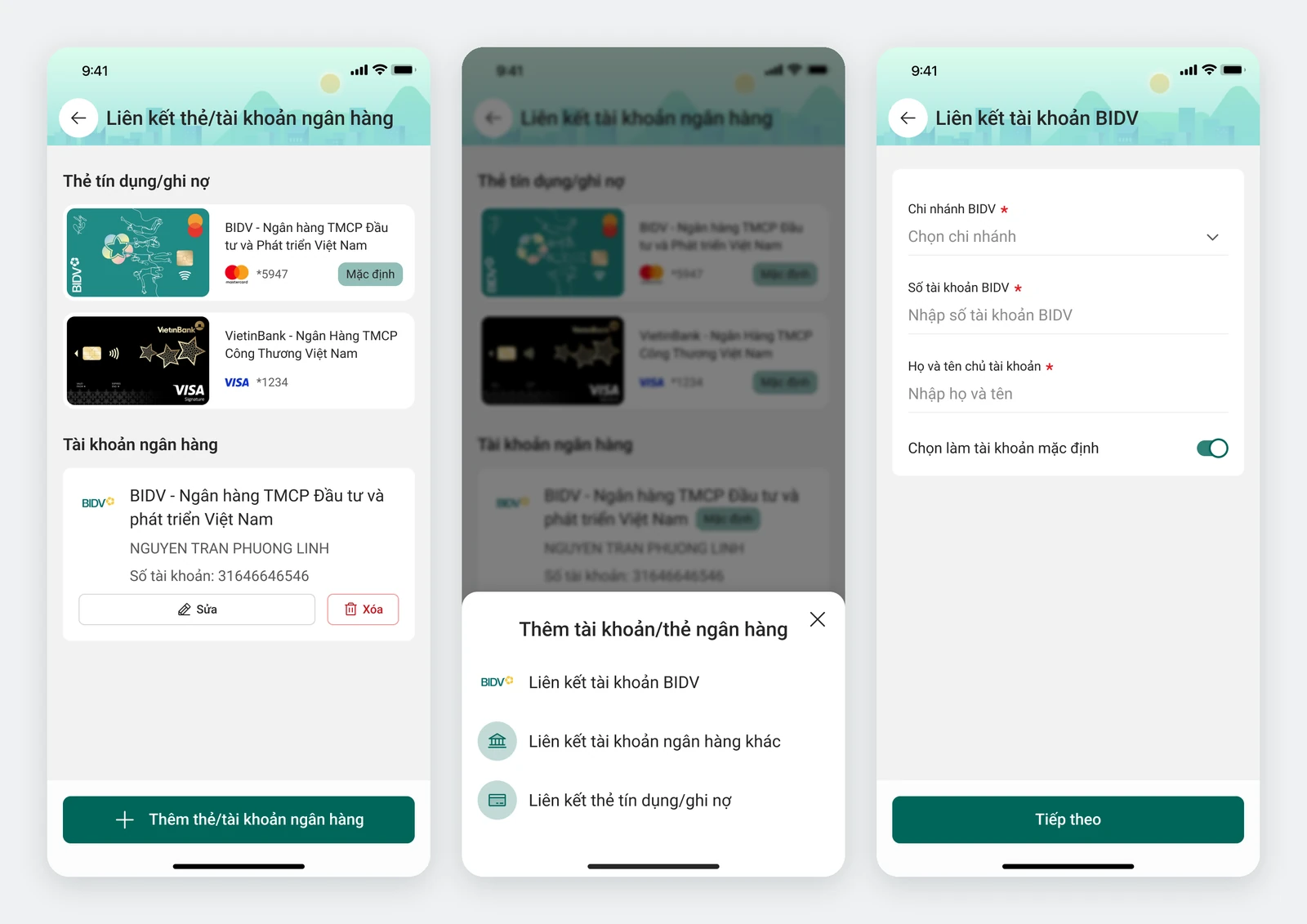
BIDV account linking was part of the first phase. Users could link their BIDV account inside BIC Online. This connected the two services before the insurance flows moved into the banking app.
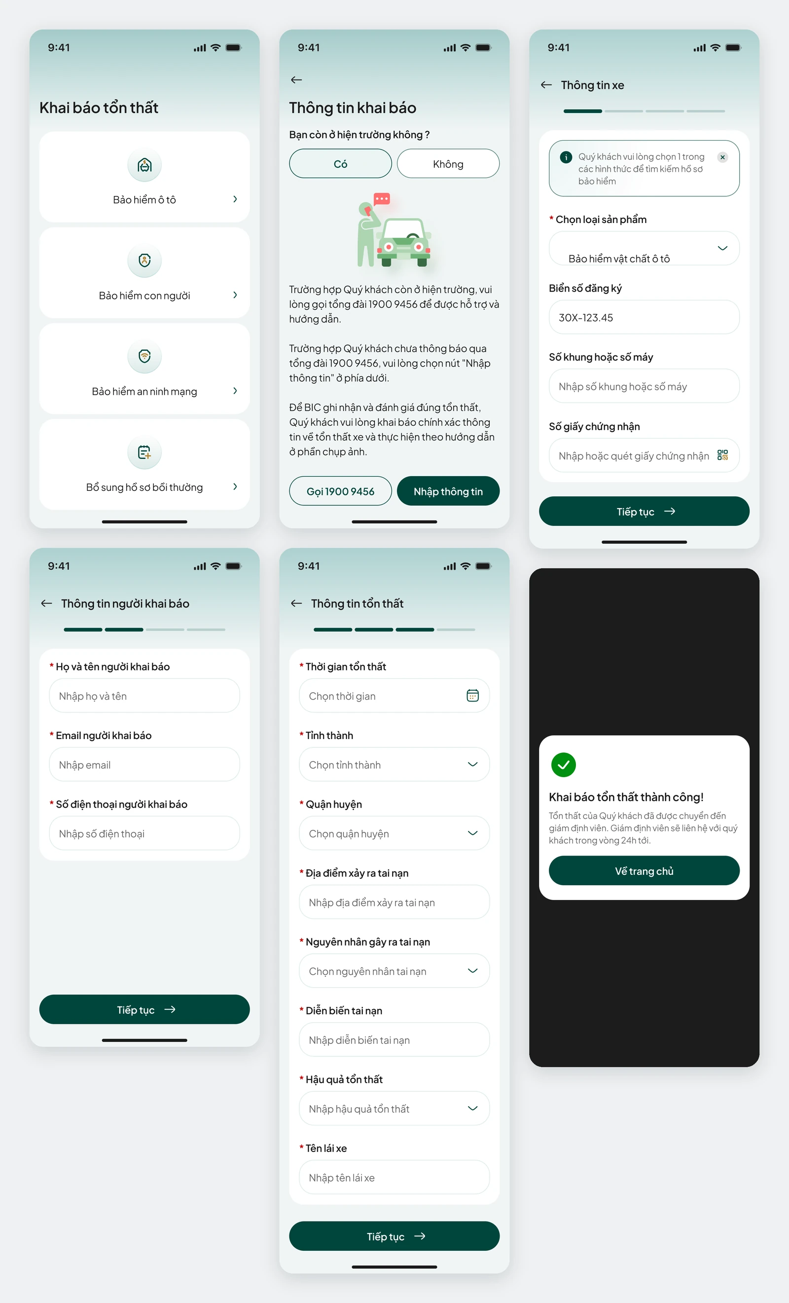
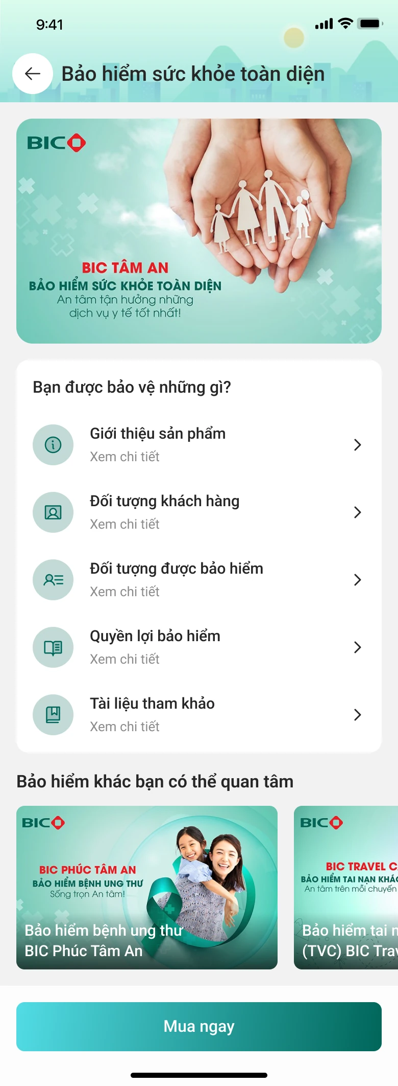
In the second phase, I focused on product flows, purchase forms, and loss declarations inside BIDV's app. The interface had to follow the bank's design system and fit its existing navigation.
The requirements still included multiple insurance lines, detailed forms, supporting photos for claims, and identity verification. The new interface needed to retain all of them.
Reduce typing and make each step clear
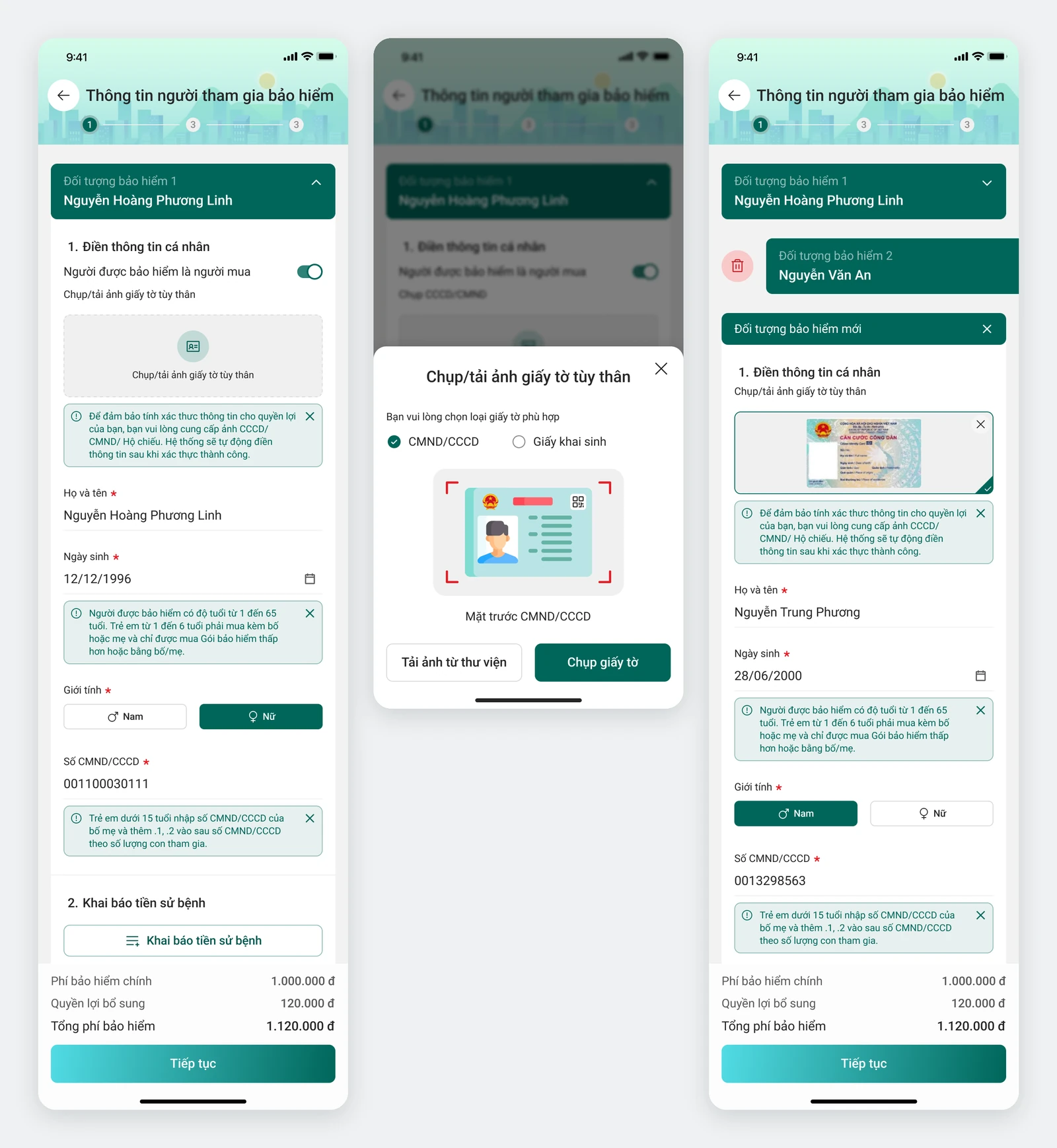
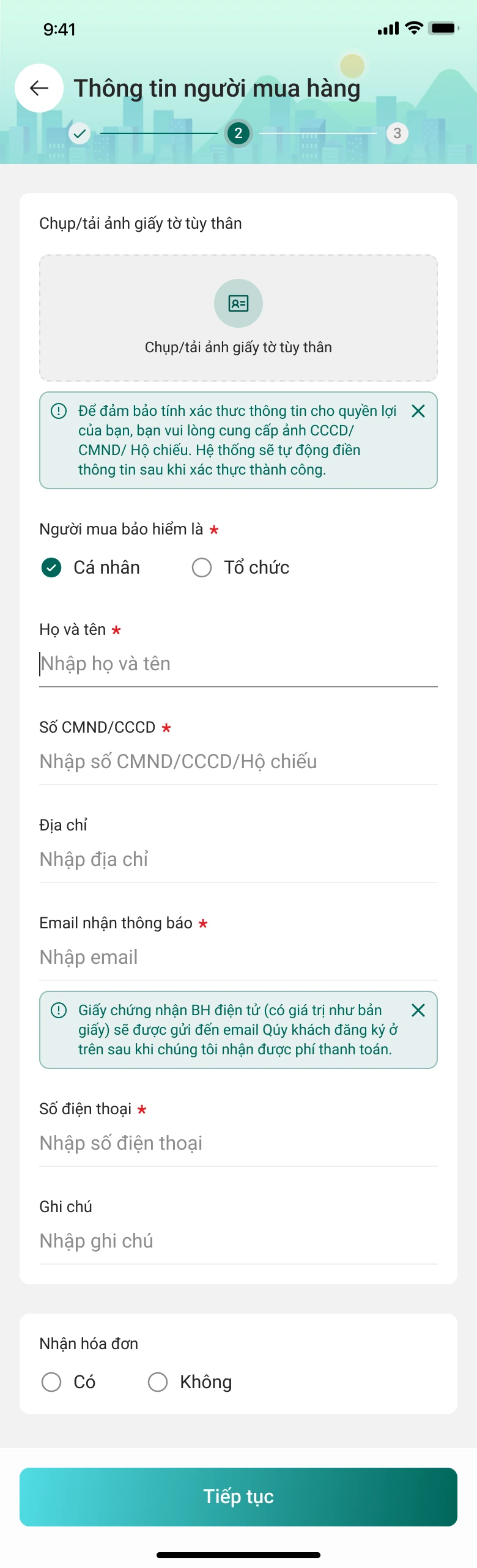
Use text recognition to fill in identity details. During identity verification, users photograph their ID card so the system can read it and populate the matching fields. This reduces manual re-entry.
Users still need to provide policy-specific details, describe losses, and add supporting photos. I kept a clear distinction between information the system could fill in and information users needed to supply.
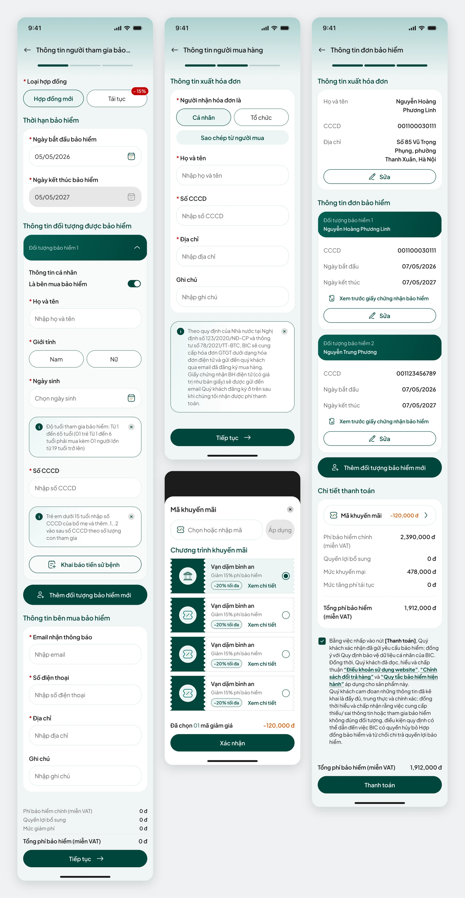
Break long forms into steps. The purchase flow needed all the information required by BIC and BIDV: the insured person, buyer, premiums and tax, vouchers, payment, and completion confirmation.
I retained the required fields while clarifying the sequence, premium summary, and image-upload requirements. The aim was to show users where they were and what they still needed to provide.
Separate purchase and claims entry points. I proposed the information structure, bottom navigation, and utility groups. BIC's business analysts clarified the insurance requirements so we could agree on the flows together.
This required early discussions with the product team and business analysts before moving into detailed screen design.
Keep the workflows and adapt to BIDV's interface
Retain the required workflow steps. Product-specific purchase flows, forms, claim photos, and processing sequences all needed to carry over to the new interface.
Apply BIDV's design system. I adjusted colors, typography, and components so the insurance features would fit the rest of the banking app.
Adapt five component patterns. Primary buttons followed the bank's style; inputs included guidance and error states; step indicators became a progress bar; uploads kept their grid layout; and navigation used BIDV's title and back button in place of BIC's bottom tabs.
The before-and-after screens show how I adapted each component pattern. I no longer have access to the BIDV library supplied during the project, so the comparisons here use the designs retained in Figma.

The same insurance workflows in two apps
I don't have publishable figures for purchases, claims processing time, or form completion. This case study focuses on the flows and interfaces I designed.
Across the two phases, I built BIC's interface and then adapted the insurance flows to BIDV's design system. Throughout, my work focused on navigation, form steps, and reducing manual entry during identity verification.
One lesson was to save exports and reference materials when a partner shares them. They make it easier to revisit design decisions later, even after access to the original library ends.

One app, two sides looking for each other
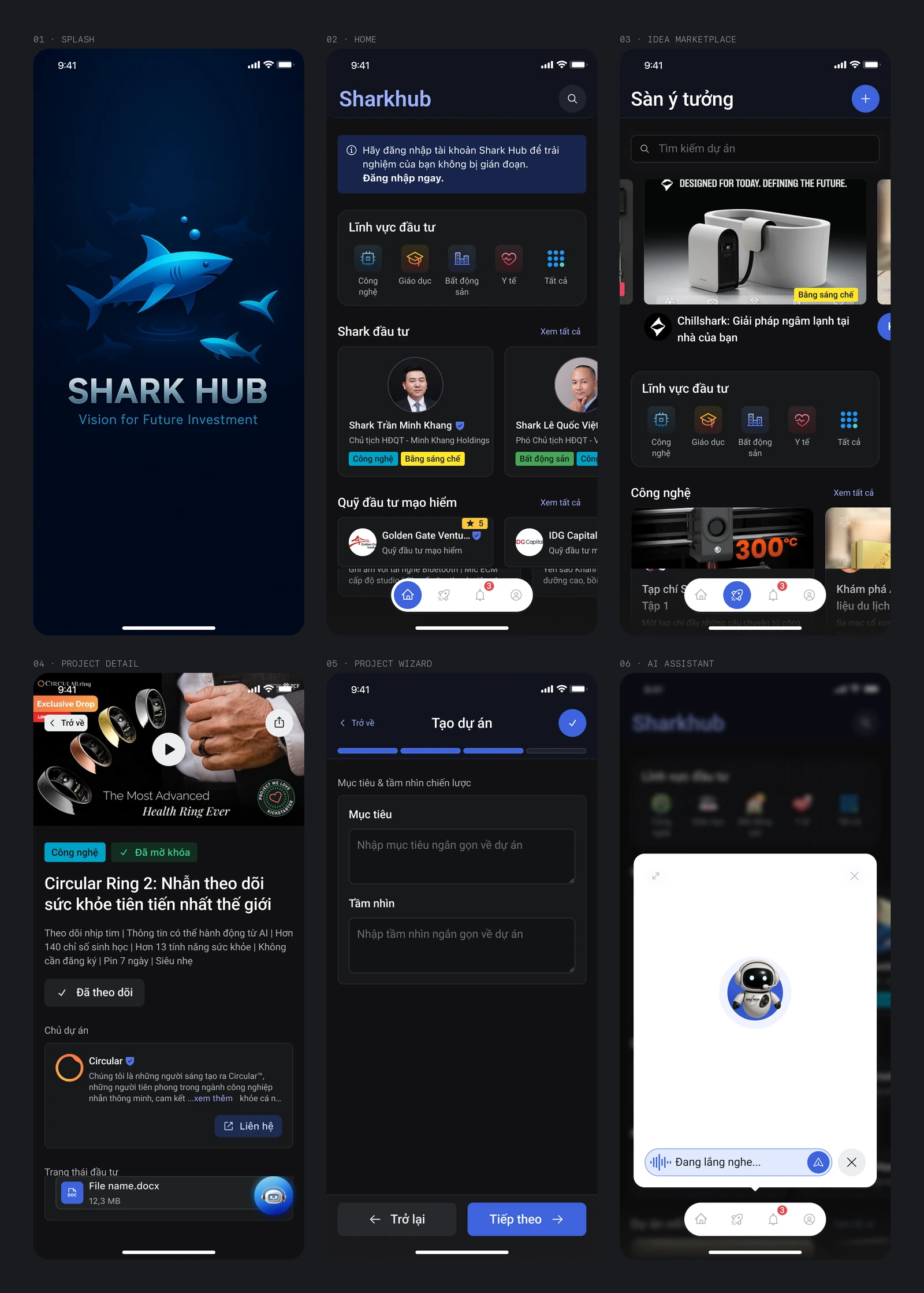
Shark Hub is a two-sided investment marketplace concept. Investors scan and filter startup deals quickly; founders submit projects that are credible without dying in a form. The deal text is dense. If both sides must read everything raw, the app is just a prettier PDF folder.
I was the only UI/UX designer on the project, working freelance for the client. My scope was UX and UI design in Figma.
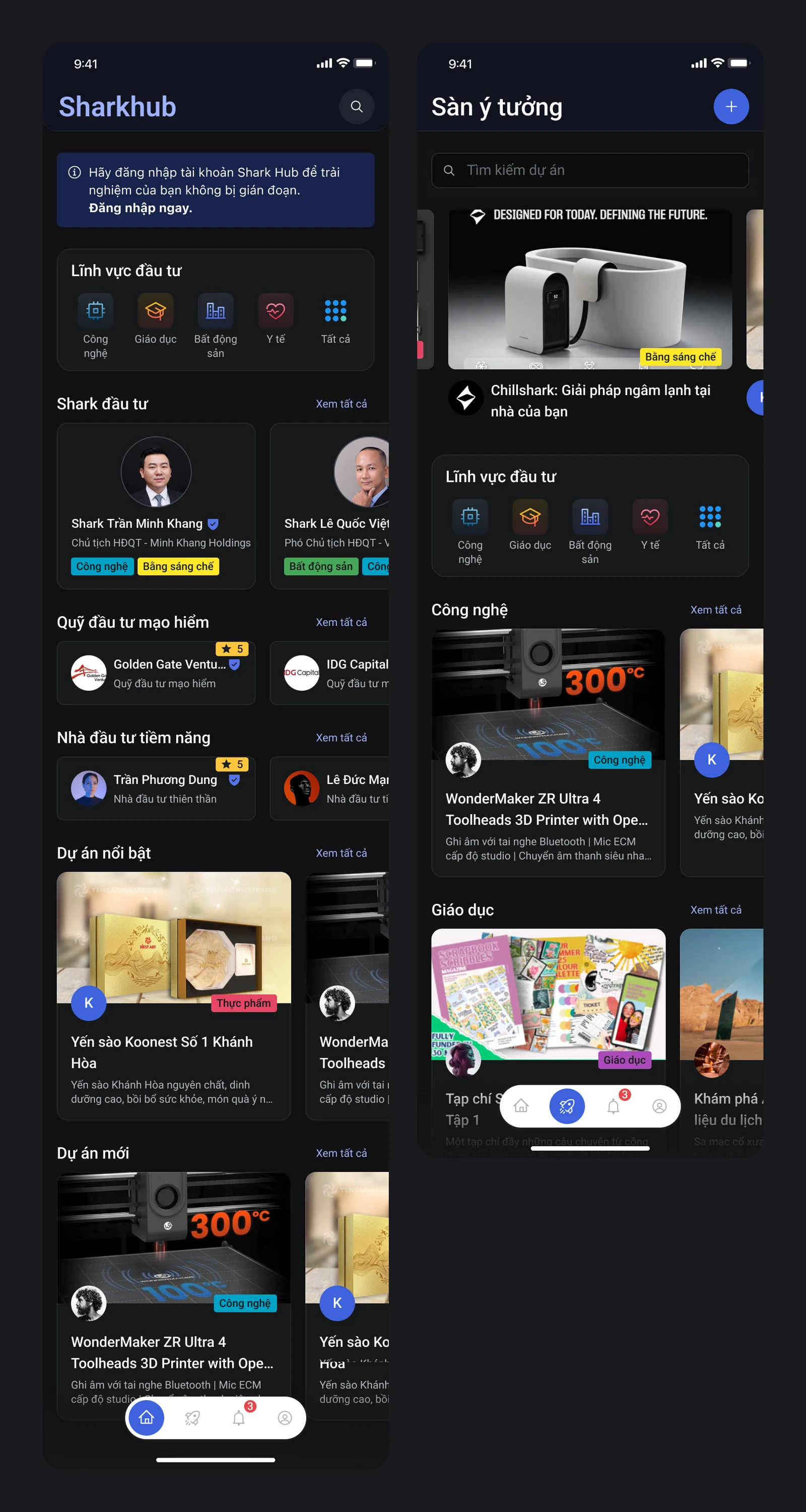
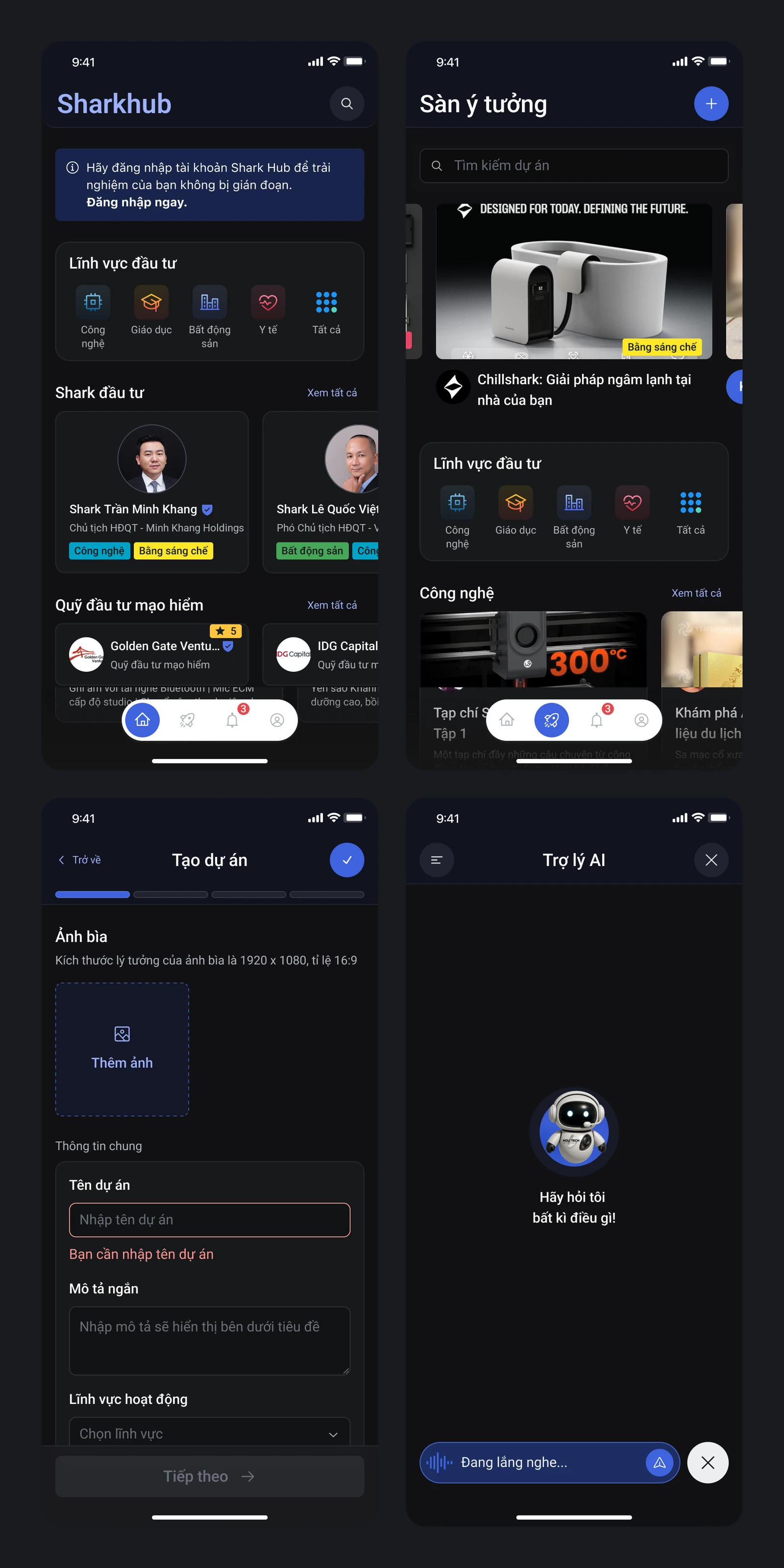
The design covers sign-up and sign-in, the home screen, the idea marketplace, a five-step submission flow, the AI assistant, and error states, all on a shared dark interface.
Three calls a hiring manager should pause on
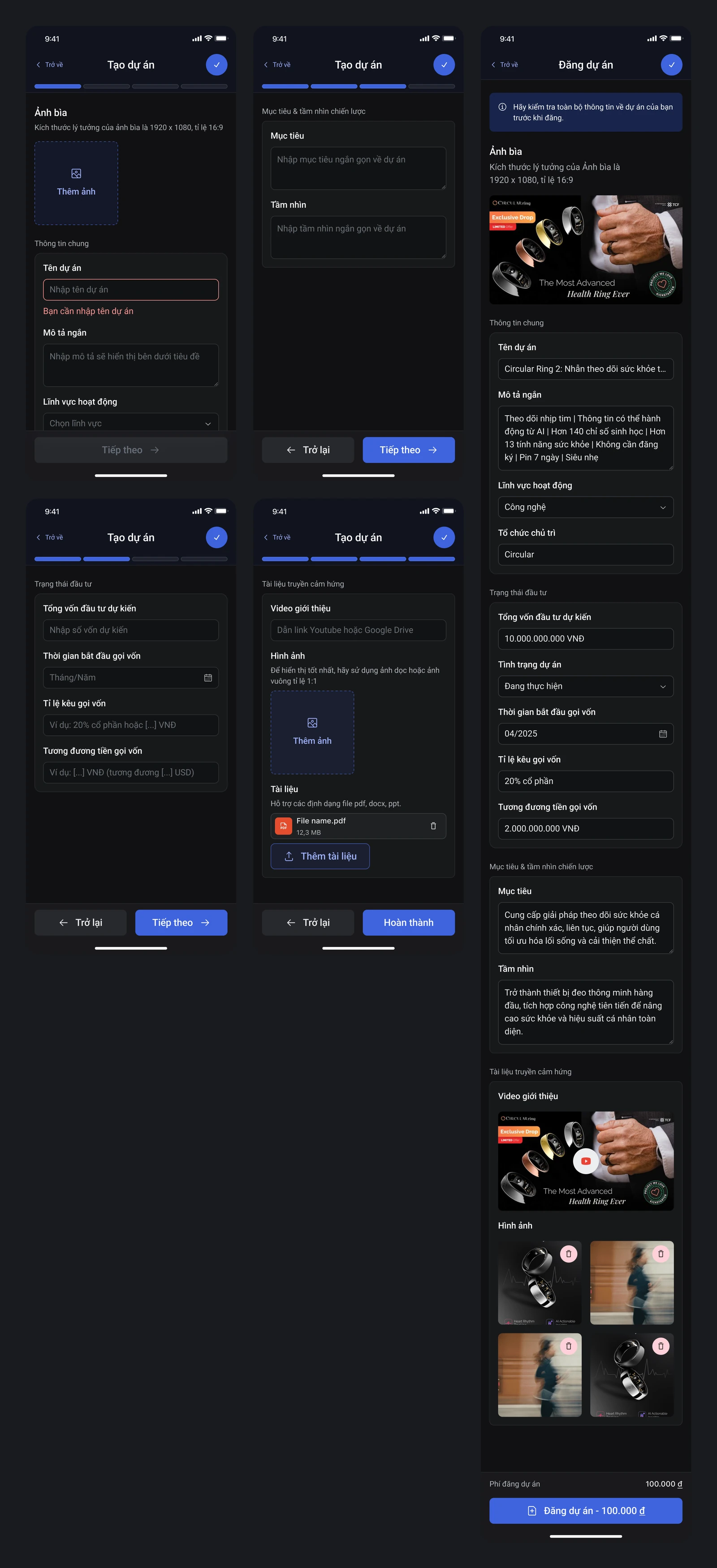
Break the submission into five steps. A funding pitch has a lot to fill in. I split the process into parts: basic information, details, images and documents, terms, and a final review before sending. Each step lets founders focus on one group of information.
The final review is still long because it brings the whole profile together. I kept it so founders can reread their pitch and catch anything missing or wrong before it reaches investors.
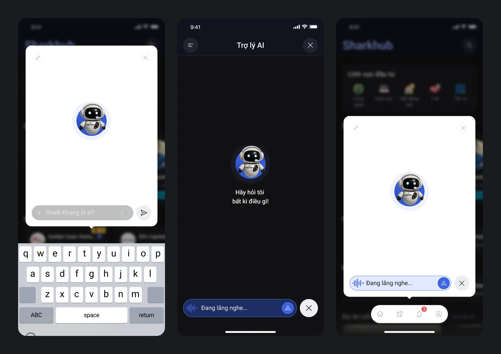
An AI assistant that is always one tap away, not a support page. Both sides need to ask fast while viewing a deal or filling a project. A FAB opens the assistant windowed to keep the screen underneath in context, fullscreen for focus, and in voice mode for when typing is awkward.
With three modes, I kept the layout and controls consistent so users can switch between them without relearning anything.
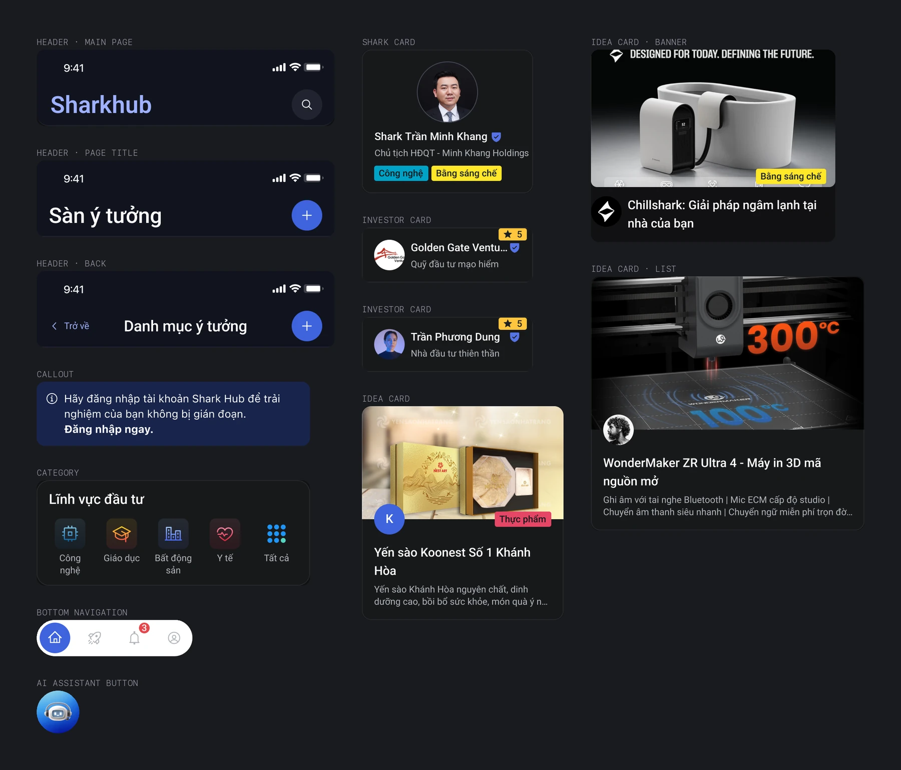
A dark interface with gold and purple accents. I chose this palette to give Shark Hub its own character and used it throughout, from the home screen and marketplace to the AI assistant.
On a dark background, secondary text and charts need careful attention to contrast. I gathered project cards, investor cards, and headers into a shared component set in Figma to keep screens consistent.
Get the key points before reading in depth
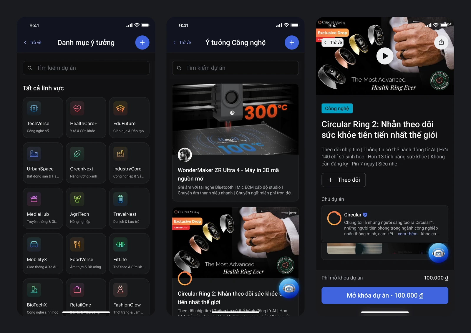
Each project on the idea marketplace appears as a card showing its sector, funding ask, and stage. Investors can scan and compare, then open a profile when a project looks like a fit. The full details sit on the detail screen, with the AI assistant on hand to help them dig deeper.
On the founder side, the profile sections follow the information shown on the card and the detail screen. What founders write is what investors read.
Results at the design stage
The deliverable was a Figma design for both user groups, covering the idea marketplace, the submission flow, and the AI assistant. I don't have real usage data to measure profile completion time, submission rate, or how much people used the AI.
The payment flow was taken out of scope during the project. After handoff, I haven't heard whether the client went on to build and launch the product.
What I took away
For funding pitches, my priority was breaking information into manageable parts and leaving room for people to check their work. The AI assistant sits inside the viewing and filling-in flow, so help is there when needed. Whether these choices work still needs testing with real users.
On my next project, I'll talk with the client earlier about their development plans and how we'll follow up after handoff. That helps me understand how the design will be used, and gives me a chance to revisit my decisions once the product is live.
Get in touch
Need design help with your project?
Tell me about your product, your team, and where you need support. We can start there and see how I can help.